Many traders struggle to identify periods of consolidation right before a major market move. The TTM Squeeze indicator, developed by John Carter, was specifically designed to address this challenge. It accurately signals these quiet periods of low volatility, which often precede an explosive breakout.
This comprehensive guide provides a detailed methodology for using the TTM Squeeze. You will learn its mechanism, how to identify a “squeeze” correctly, and how to execute high-probability trades during the subsequent momentum shift.
Key Takeaways
- The TTM Squeeze, developed by John Carter, identifies periods of low volatility (a “squeeze”) that often precede a significant price move.
- It works by detecting when Bollinger Bands contract and move inside Keltner Channels.
- The indicator’s histogram helps gauge the velocity, direction, and strength of the price move once the squeeze “fires.”
- Effective approaches involve trading breakouts, trend continuations, and identifying potential market reversals.
- This is a volatility and momentum tool, not a standalone indicator, so it should be combined with other technical analysis tools.
1. What Is the TTM Squeeze?
The TTM Squeeze is a technical indicator developed by trader John Carter (2012), which identifies periods of very low price volatility (known as a “squeeze”) that often occur right before a significant price breakout (StockCharts, 2024; TrendSpider, n.d.).
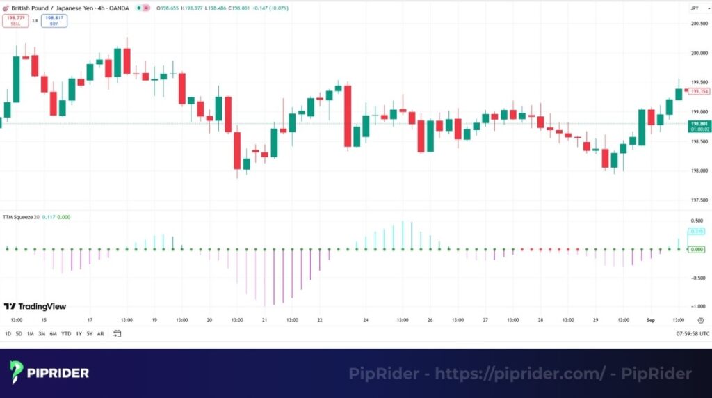
In technical analysis, the TTM Squeeze signals when a market is consolidating and building energy for its next move. This makes it an invaluable tool for momentum and breakout trading, as it helps traders anticipate when a quiet market is about to become very active, providing a clear edge in timing entries.
2. Understanding the Components and Core Logic
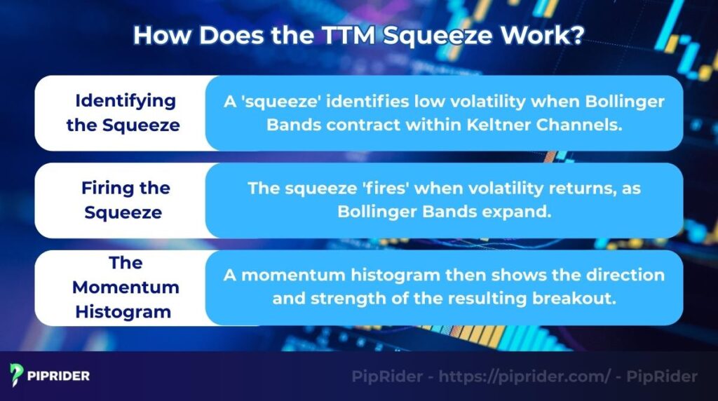
The TTM Squeeze is a “hybrid” system. It combines three distinct technical tools into a single dashboard to visualize the market’s volatility cycles. Understanding how these parts interact is the key to mastering the indicator.
2.1. The Volatility Setup (Bollinger Bands & Keltner Channels)
Bollinger Bands measure standard deviation to track volatility, while Keltner Channels define a trend’s “normal” range using the Average True Range (ATR). The relationship between these two envelopes determines the volatility state:
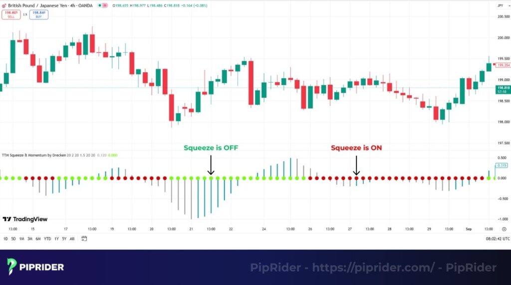
- Squeeze ON (Consolidation): The Bollinger Bands contract and move completely INSIDE the Keltner Channels. Such a state indicates the market is “taking a breath,” coiling energy for a potential breakout. Central Dots turn a specific color (often Red) to signal this compression.
- Squeeze OFF / Fired (Expansion): The Bollinger Bands expand and burst OUTSIDE the Keltner Channels. The released energy signals that a volatile move has likely begun. Central Dots change color (often to Green) to confirm the “Fire.”
2.2. The Momentum Direction (The Histogram)
While the bands signal the timing of a move, the Momentum Histogram acts as the compass for direction. It uses a smoothed Linear Regression algorithm to identify the trend’s velocity without the typical lag found in traditional oscillators.
The indicator measures momentum relative to a Zero Line:
Bullish State (Above Zero):
- Rising Bars: Buyers are gaining strength (Velocity increasing).
- Falling Bars: Buyers are losing momentum (Trend weakening).
Bearish State (Below Zero):
- Deepening Bars: Sellers are gaining control (Velocity increasing).
- Rising Bars: Sellers are losing momentum (Trend weakening).
3. How to Read TTM Squeeze Signals
Because the TTM Squeeze has been adapted for many different trading platforms, the default color coding can be confusing. To avoid mistakes, do not just memorize a color; you must memorize the state of the indicator.
3.1. The “Traffic Light” System (Interpretation Table)
Here is how to interpret the signals on the most popular platforms like TradingView, StockCharts, and Thinkorswim (TOS).
| Signal State | TradingView / StockCharts | Thinkorswim (Original) | Actionable Meaning |
|---|---|---|---|
| 🔴 Squeeze ON | Red Dots | Red Dots | Volatility is compressed. DO NOT TRADE yet. Wait for the expansion. |
| 🟢 Squeeze FIRED | Green (or Gray) Dots | Green Dots | Volatility has returned. The move has started. Look at the Histogram now. |
| Strong Bullish | Light Blue / Green Bars | Cyan (Light Blue) Bars | Aggressive buying. Ideal Long Entry. |
| Weakening Bullish | Dark Blue Bars | Dark Blue Bars | Uptrend is losing steam. Tighten stops or Take Profit. |
| Strong Bearish | Red Bars | Red Bars | Aggressive selling. Ideal Short Entry. |
| Weakening Bearish | Yellow / Orange Bars | Yellow Bars | Downtrend is losing steam. Prepare to exit shorts. |
⚠️ Important Check: Before trading real money, always verify your specific platform’s settings. Look at a past chart:
- Where price moved sideways → What color were the dots? (That is your Squeeze ON color).
- Where price exploded → What color were the dots? (That is your Squeeze OFF color).
3.2. Case Study: Tesla (TSLA) – Anatomy of a Perfect Trade
Let’s analyze a real-world example to see exactly how to execute the signals.
The Context: In January 2023, Tesla (TSLA) had been in a brutal downtrend but started to consolidate (move sideways) between $100 and $120.
The Trade Sequence (Step-by-Step):
- The Setup (Squeeze ON):
- Date: mid-January 2023.
- Indicator: TTM Squeeze printed Red Dots for 5+ days.
- Price Action: Price compressed tightly, holding below the 21-period EMA. This was the “coiling” phase.
- The Trigger (The “Go” Signal):
- Date: January 26, 2023.
- Squeeze Fired: The central dot turned Green (Volatility returned).
- Momentum: The Histogram printed a tall Cyan (Light Blue) bar above zero.
- Confluence (Crucial): Price broke significantly ABOVE the 21 EMA and cleared the consolidation resistance ($145 level) on high volume.
- The Execution:
- Entry Rule: Enter on the close of the breakout candle (approx. $160) OR on the retest of the breakout level.
- Stop Loss: Placed below the low of the “Squeeze range” or below the 21 EMA (approx. $135).
- The Management (Exit):
- Rule: Stay in the trade as long as Histogram bars remain Cyan (Rising).
- Exit Signal: In mid-February, the histogram bars turned Dark Blue (Momentum Weakening) for two consecutive days.
- Result: The stock rallied from ~$160 to ~$210, a +30% move in weeks.
Key Takeaway: We didn’t just buy because of a Green Dot. We bought because of the Confluence: Green Dot + Histogram Rising + Price > 21 EMA + Breakout.
4. How TTM Squeeze is Calculated
While trading platforms calculate this automatically, understanding the underlying formula is crucial. It helps you trust the signals and realize why the TTM Squeeze is smoother and more reliable than standard oscillators.
4.1. The Volatility Component (The “Squeeze”)
The indicator detects a squeeze by comparing two volatility envelopes. John Carter’s standard settings are:
- Bollinger Bands (BB): Length 20, StdDev 2.0.
- Keltner Channels (KC): Length 20, Multiplier 1.5 (using ATR).
The Squeeze Condition: A “Red Dot” (Squeeze ON) appears only when the Bollinger Bands are completely inside the Keltner Channels.
The Mathematical Logic:
Upper BB < Upper KC AND Lower BB > Lower KC
4.2. The Momentum Component (The Histogram)
This is where most traders get it wrong. The histogram is NOT a simple Moving Average convergence (like MACD). It uses a complex algorithm to predict direction.
The histogram calculates the distance (Delta) between the current price and the average of two specific values:
- Donchian Midline: Calculated over 20 periods.
- Simple Moving Average (SMA): The average price over 20 periods.
The “Secret Sauce”: The final delta is not plotted directly. Instead, it is smoothed using Linear Regression.
- Why this matters: Linear Regression attempts to “fit” the data to a straight line, filtering out erratic price spikes. This is why the TTM Squeeze histogram looks much smoother and produces fewer false signals than a standard MACD.
4.3. Important Note on Keltner Channels
Not all Keltner Channels are calculated the same way, which can lead to slightly different signals on different platforms.
- The “Original” Keltner (1960): Uses Simple Moving Average (SMA) and High-Low range.
- The “Modern” Keltner (Standard for TTM): Uses Exponential Moving Average (EMA) and Average True Range (ATR).
⚠️ Pro Tip: If you are manually adding Keltner Channels to your chart to visualize the squeeze, ensure you are using the ATR-based version with a multiplier of 1.5. If you use the default multiplier (often 1.0 or 2.0), your visual squeeze will not match the indicator’s dots.
5. TTM Squeeze Trading Playbooks (Rule-Based Strategies)
Knowing “how it works” is not enough. To be profitable, you need a strict execution plan. Below are the three specific setups used by professional traders, ranked from highest to lowest probability.
5.1. Playbook A: The Classic “Squeeze Breakout”
Best For: Assets moving sideways in a clear range after a previous move. This is the standard approach to capture explosive momentum.
1. The Context (The Setup)
- Market Condition: Price is compressing in a visible “Box” or Range.
- Squeeze Duration: The Red Dots must be present for at least 5 bars.
- Note: Extended duration (10+ bars) implies more energy is built up for a larger move.
2. The Trigger (The Signal)
- Squeeze FIRES: The central dot turns Green.
- Histogram Check:
- Longs: Histogram turns Cyan/Light Blue (Above Zero).
- Shorts: Histogram turns Red (Below Zero).
3. The Execution (Entry)
- Do NOT enter just because the dot turns green.
- Volume Rule: Look for a volume spike (Relative Volume > 1.5) on the firing candle.
- Entry Trigger: Enter only when price breaks and closes outside the consolidation range (Range High for Longs, Range Low for Shorts).
4. Risk Management (SL & TP)
- Stop Loss: Place just below the middle of the consolidation box or the recent Swing Low.
- Take Profit: Apply the “8-10 Bar Rule” (momentum moves typically last 8-10 candles).
- Technical Exit: Close the trade immediately if the Histogram changes color (e.g., Cyan to Dark Blue), signaling momentum is fading.
5.2. Playbook B: The Trend Continuation (High Probability)
Best For: Strong trending markets. Instead of guessing direction, you trade with the dominant flow. Safest for beginners.
1. The Context (Trend Filter)
- Long Setup: Price is trading ABOVE the 21 EMA and 50 EMA.
- Short Setup: Price is trading BELOW the 21 EMA and 50 EMA.
- Action: Wait for price to pull back to the EMAs and form a Squeeze (Red Dots).
2. The Trigger (The Signal)
- Squeeze FIRES: The dot turns Green in the direction of the main trend.
- Momentum: The Histogram expands in the trend’s direction (e.g., Rising Cyan bars for Uptrend).
3. The Execution (Entry)
- Entry Trigger: Enter when price breaks above the high of the pullback pattern (Flag Breakout).
- Invalidation (No-Go Rule): If the Squeeze fires against the trend (e.g., Red Histogram in an Uptrend), IGNORE IT. This is likely a fakeout.
4. Risk Management
- Stop Loss: Below the recent pullback low or below the 21 EMA.
- Take Profit: Target the previous Swing High (for Longs) or use a trailing stop along the 21 EMA.
5.3. Playbook C: The Reversal / Failed Move (Advanced)
Best For: Overextended markets showing exhaustion. Warning: This is counter-trend trading; strict discipline is required.
1. The Context (Divergence)
- Price Action: Price is making Higher Highs (Uptrend) or Lower Lows (Downtrend).
- Momentum: The TTM Squeeze Histogram is making the Opposite move (Lower Highs or Higher Lows).
- Meaning: Buying/Selling power is drying up despite price movement.
2. The Trigger (The Signal)
- A Squeeze forms at the top/bottom and FIRES with a Histogram Color Change (e.g., flips from Blue to Red).
3. The Execution (Confirmation)
- Do NOT predict the exact top.
- Entry Trigger: Wait for Price Action confirmation. Enter only when price breaks the recent Market Structure (e.g., breaks the recent Swing Low).
4. Risk Management (Crucial)
- Position Size: Reduce normal size by 50% (Counter-trend tax).
- Stop Loss: Strictly above the recent High (for Shorts) or below the recent Low (for Longs).
- Take Profit: Aim for the mean (21 EMA) as the first target.
5.4. Bonus Playbook: Scalping & Day Trading (The 5-Minute Rule)
Best For: Fast-paced markets (Forex, Crypto, Indices). Warning: Lower timeframes have high “noise.” Strict filtering is required to survive.
1. The Context (The “Anchor” Rule)
- Concept: Never trade against the Higher Timeframe.
- The Rule: Before looking at the 5-minute chart, check the 1-hour trend.
- If 1H is Bullish (Price > 21 EMA) → Only look for Long Squeezes on 5m.
- If 1H is Bearish (Price < 21 EMA) → Only look for Short Squeezes on 5m.
2. The Trigger (The Signal)
- Squeeze FIRES: Green dot appears in the direction of the Anchor Trend.
- Volume: Essential. Do not take a scalp trade if volume is low (e.g., during lunchtime 12:00 PM – 1:30 PM EST).
3. The Execution (Aggressive Entry)
- Entry Trigger: Enter immediately on the close of the breakout candle that aligns with the 1H trend.
- Speed: Speed is key. Do not wait for a retest, as strong intraday moves often don’t look back.
4. Risk Management (ATR is King)
- Stop Loss: Do not use a fixed point stop. Place SL at 1.5x or 2x the ATR value below the entry candle. This prevents getting stopped out by random market noise.
- Take Profit: Be less greedy than Swing Trading.
- TP1: Sell 50% at 1:1 Risk/Reward.
- TP2: Target the next local Support/Resistance level.
6. Scanners and Filters: How to Find the Squeeze
You cannot watch 100 charts at once. Using a scanner is the most efficient way to find assets that are currently “squeezing” (building energy) and preparing for a move.
6.1. The Universal “Squeeze Logic”
Regardless of the platform, a squeeze is mathematically defined by this relationship:
The Squeeze Condition:
Bollinger Band Width < Keltner Channel Width
- Logic: When the volatile bands (BB) fit completely inside the trend bands (KC), volatility is compressed.
- Volume Filter: Always add
Relative Volume > 1.5to your scan. This ensures there is genuine market interest behind the potential breakout.
6.2. Scanning on TradingView (The Workaround)
Important: TradingView’s standard Stock Screener does NOT have a native “TTM Squeeze” filter. Do not waste time looking for it in the dropdown menus.
The Best Solution: Use a “Dashboard” Indicator
Instead of the screener, use a community-built script that draws a scanner table directly on your chart.
- Open your chart and click Indicators.
- Search for “TTM Squeeze Screener” or “Squeeze Pro Dashboard”.
- Select a top-rated script (e.g., by Console or MornE).
- Result: A table will appear on your screen showing the Squeeze status (On/Off) for your entire watchlist (e.g., BTC, ETH, SOL, or AAPL, TSLA, NVDA) simultaneously.
6.3. Scanning on Thinkorswim (Native Support)
Thinkorswim (TOS) is the “home” of this indicator and has the most powerful native scanner.
- Go to the Scan tab.
- Click ‘Add Filter’ → Select ‘Study’.”
- In the study menu, search for
TTM_Squeeze. - Set the condition:
- Scan for:
Squeeze_Onis TRUE.
- Scan for:
- Hit Scan.
- Result: The platform returns a live list of all stocks currently in a volatility squeeze (Red Dots), ready for you to analyze.
7. Pros & Cons of the indicator
Here’s a quick breakdown of the indicator’s strengths and weaknesses.
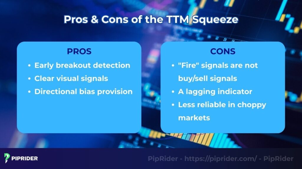
Pros
- Early breakout detection: Its greatest strength is identifying consolidation periods just before a major price move.
- Clear visual signals: The red/green dots and histogram are very easy to read, even for beginners.
- Directional bias provision: Unlike pure volatility indicators, the histogram gives a clear suggestion of the breakout’s likely velocity.
Cons
- “Fire” signals are not buy/sell signals: The green dot (the “fire”) is not a buy or sell signal. It only signals that volatility has returned, not which way the price will go.
- A lagging indicator: Because it relies on moving averages, it can be slightly behind the price in fast-moving markets.
- Less reliable in choppy markets: It can produce false “fire” signals in trendless, sideways markets.
8. Frequently asked questions about TTM Squeeze
9. Summary
The TTM Squeeze is more than just an indicator; it’s a specialized tool for understanding market volatility cycles. Its true power lies in its ability to alert traders to periods of consolidation, offering a unique edge in anticipating significant momentum shifts.
By combining the simple “squeeze on/off” signals with the directional bias of the histogram, you can build a robust framework for timing your entries. Remember, always use it as a confirmation tool within a broader trading plan, which should be part of your overall investment strategies. Consistent practice is the key to building confidence and effectively using this volatility tool.
Ready to learn forex and find your next competitive advantage in the markets? Join the 300,000+ traders who rely on Piprider to transform deep market analysis into a consistent trading edge.