It’s common for investors to feel confused when major financial news channels report a market index, like the S&P 500, hitting a record high, yet their individual portfolio performance is mixed. This scenario of divergence, where the index soars but many individual stocks lag, is a classic market problem.
Fortunately, there’s a powerful tool designed to cut through this noise: the Advance Decline Line (A/D Line). It functions as an honest, behind-the-scenes “health report” for the entire stock market, revealing the true level of participation beneath the index’s price.
This guide provides a perfect starting point for any beginner, breaking down this professional-grade tool into simple, understandable steps. Readers will move from basic definitions to deep insights, gaining the confidence needed to analyze the market effectively.
Key Takeaways
- The Advance Decline Line (A/D Line) tracks the net number of advancing vs. declining stocks to gauge the market’s internal health.
- If the A/D Line rises with the market index (e.g., S&P 500), the rally is healthy and sustainable.
- Divergence (A/D fails to match the index’s new extreme) is a powerful early warning of trend exhaustion.
- It cuts through price distortion caused by a few large stocks, revealing true broad market participation.
- Analyze on daily charts as a macro-strategic tool, confirming its signals with price action.
1. What is the Advance Decline Line?
The Advance Decline Line (A/D Line) is a specialized technical indicator used to measure a concept called market breadth.
The A/D Line concept was first calculated and analyzed in 1926 by economist and market analyst Colonel Leonard Ayres. Subsequently, the concept was popularized by James Hughes and began to be published by financial journals like Barron’s in the 1930s, gaining significant prominence in the 1960s (CMT Association).
At its core, the A/D Line tracks the cumulative total of advancing stocks minus declining stocks each day. Its primary purpose is to provide a health report for the entire market, revealing the true level of participation beneath the surface price.
When looking at the daily data, traders focus on three key aspects:
- Trend Confirmation: It is used to confirm the trend of major indices (like the S&P 500).
- Health Signal: A rising A/D line suggests broad market strength; a falling A/D line signals underlying weakness.
- Core Principle: It shows how many individual stocks are genuinely driving the trend, rather than just a few mega-cap stocks.
2. Why the A/D Line Matters More Than Most Indicators
To understand the true value of the Advance Decline Line, you must understand how it differs from 90% of the technical indicators on your charting platform.
The distinction comes down to one core concept: Price vs. Breadth.
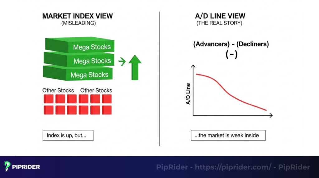
- Most Indicators are Price-Based: Popular tools like Moving Averages, RSI, or MACD are derivatives of price. They simply take the index’s past price, apply a formula, and plot a line. If a few mega-cap tech giants drag the S&P 500 higher, these price-based indicators will look extremely bullish, even if 400 other companies in the index are quietly crashing. They only show you the surface.
- The A/D Line is Breadth-Based: The A/D Line does not track price; it tracks participation. It operates on a strict “one stock, one vote” system. It doesn’t care if a company is a $3 trillion tech behemoth or a small regional bank. If a stock closes higher, it gets a +1. If it closes lower, it gets a -1.
The Ultimate Insight: Price Can Lie, Breadth Shows Reality
A market index can be easily distorted by a handful of massive companies. The A/D Line strips away this distortion. It acts like an X-ray for the stock market, revealing whether a rally is built on solid concrete (broad participation across all sectors) or a fragile house of cards (just a few heavy lifters).
3. What Does the Advance Decline Line Actually Tell You?
While an index like the S&P 500 tells you what the market is doing, the Advance Decline (A/D) Line tells you why. It answers the ultimate “So what?” for traders by looking under the hood of the price action.

Essentially, the A/D Line provides three crucial pieces of intelligence:
- Evaluates Market Breadth: It tells you exactly how many stocks are participating in the move. It answers whether the whole market is rising together, or if the index is just being propped up artificially by a few mega-cap tech stocks.
- Confirms Trend Strength: It verifies if the current market direction is genuine and structurally sound. Broad participation means the trend has strong fundamental fuel.
- Detects Early Divergences: It acts as an early warning radar, exposing internal market weakness weeks or even months before the actual index price collapses.
The “So What?” Examples in Action
To quickly gauge the reality of the market, you only need to compare the index price to the A/D Line. Here is what it tells you:
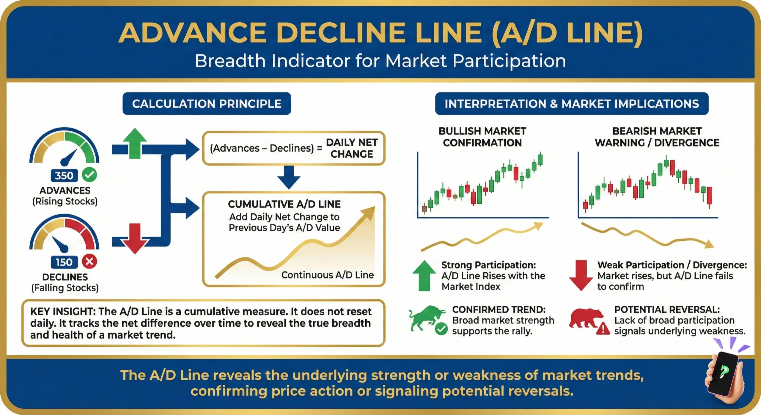
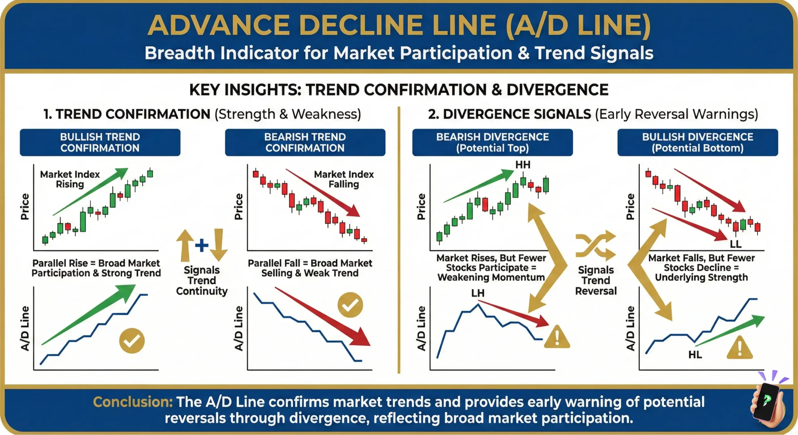
- Index Up + A/D Line Up –> Strong Trend: When the S&P 500 hits a new high and the A/D Line also hits a new high, the rally is healthy. The majority of stocks are climbing, confirming that the upward trend is robust and safe to trade.
- Index Up + A/D Line Down –> Weak Rally: When the S&P 500 hits a new high, but the A/D Line drops (forming a lower high), the rally is extremely fragile. This divergence proves that the average stock is already selling off. It is a massive red flag warning you of an imminent market correction.
4. Best Markets to Use the A/D Line
The Advance Decline Line is a specialized tool. Because it relies on the concept of “market breadth”—the collective movement of hundreds or thousands of individual assets—its effectiveness depends entirely on the structure of the market you are analyzing.
Market Compatibility Overview
| Asset Class | Compatibility | Why? |
|---|---|---|
| Stock Indices | ⭐⭐⭐⭐⭐ (Best) | High number of individual components; clear “one stock, one vote” data. |
| Equities (Exchanges) | ⭐⭐⭐⭐⭐ (Best) | Built for broad exchanges like the NYSE and NASDAQ. |
| Forex | ⭐ (Not Ideal) | Decentralized market; lacks a unified list of thousands of advancing pairs. |
| Cryptocurrency | ⭐⭐ (Limited) | High correlation; most Altcoins simply mirror Bitcoin’s price action. |
- Stocks & Major Indices (The Gold Standard): This is where the A/D Line shines. It is most effective when applied to broad-based indices like the S&P 500, Russell 2000, or the NYSE Composite. These markets provide the massive data pool (hundreds of stocks) necessary to generate a statistically significant “health report” of the economy.
- Forex (Not Recommended): You cannot use the A/D Line on a single pair like EUR/USD. Forex is a decentralized market without a centralized “advance-decline” tally. Note: If you are a Forex trader, use the Chaikin Accumulation/Distribution indicator instead. It analyzes volume for a single pair, which is far more relevant than market breadth in the currency world.
- Cryptocurrency (Limited/Experimental): While some platforms offer A/D Line data for the total crypto market, its value is limited. Cryptocurrency markets are currently highly correlated. When Bitcoin moves, the vast majority of altcoins move with it, often making “breadth” analysis redundant as it rarely shows the internal decay found in the diverse stock market.
5. How to calculate the A/D Line?
The Advance Decline (A/D) Line’s formula might look technical, but its core concept is quite simple.
The A/D Line is calculated cumulatively in two straightforward steps:
- Daily “Net Advances”: Each day, the market determines the “Net Advances.” This is simply the number of stocks that went up minus the number of stocks that went down.
- Cumulative Sum: This daily “Net Advances” figure is then added to the previous day’s total A/D Line value.
So, the formula is:
A/D Line = Yesterday’s A/D Line Value + Today’s Net Advances
Traders do not need to manually calculate the A/D Line, as charting software performs the math instantly. The essential task for the analyst is to focus entirely on reading the story the resulting line tells. This is a tool of interpretation, not calculation.
6. How to Read the A/D Line Step by Step
Instead of guessing what the market is doing, use this simple, four-step framework to analyze the Advance Decline Line like a professional:
- Step 1: Benchmark the Index. Start your analysis by examining the price action of a major benchmark (such as the S&P 500 or NYSE Composite). Determine its primary direction: is it charting higher highs or lower lows?
- Step 2: Overlay the A/D Line. Pull up the Advance Decline Line indicator on your charting platform. Place it directly beneath the index to share the exact same timeline for an accurate comparison.
- Step 3: Hunt for Confirmation or Divergence. Observe the relationship between the price chart and the indicator. Are they moving in perfect sync (confirming each other), or are they moving in opposite directions (diverging)?
- Step 4: Execute Based on Trend Strength. Formulate your trading bias based on the evidence. If the index and the A/D Line confirm each other, the trend is strong and safe to follow. If they diverge, the rally is weak, highlighting a high probability of a market reversal.
Pro Tip: For the most accurate market breadth readings, institutional traders often prefer using the NYSE Composite A/D Line. Because the NYSE encompasses a much wider and more diverse range of companies than the tech-heavy Nasdaq, it provides a purer reflection of overall global market health.
The A/D Line Cheat Sheet
| Market Behavior (Index Price) | A/D Line Behavior | Meaning (Market Context) |
|---|---|---|
| Price Up | A/D Up | Strong Bullish Trend (Healthy broad participation) |
| Price Up | A/D Down | Weak Rally (Bearish divergence, high risk of top) |
| Price Down | A/D Down | Strong Bearish Trend (Widespread selling pressure) |
| Price Down | A/D Up | Potential Reversal (Bullish divergence, quiet accumulation) |
7. How to Apply the Advance Decline Line in Actual Market Analysis
This is where we turn knowledge into actionable strategy. Let’s explore the two powerful ways to use the A/D line, complete with real-world scenarios.
7.1. Confirming the trend
This is the most straightforward use and a great way to build your confidence. You are simply checking if the market’s internals agree with its external appearance.
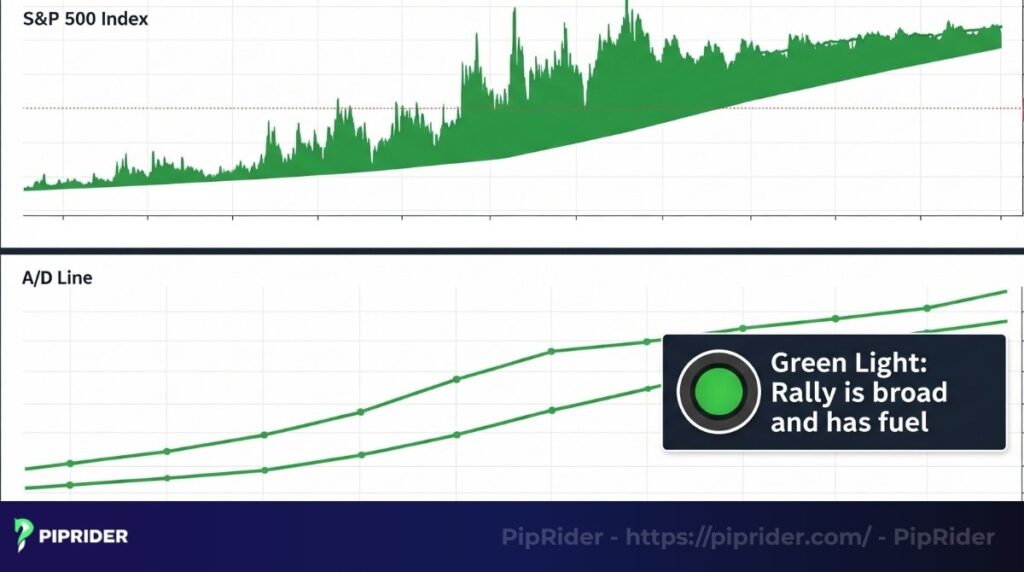
- In a healthy bull market: The S&P 500 is making a series of new highs. You look at your A/D line chart, and it’s doing the exact same thing, marching right up alongside the index. This confirmation feels like a green light. It tells you the rally is broad and has fuel in the tank.
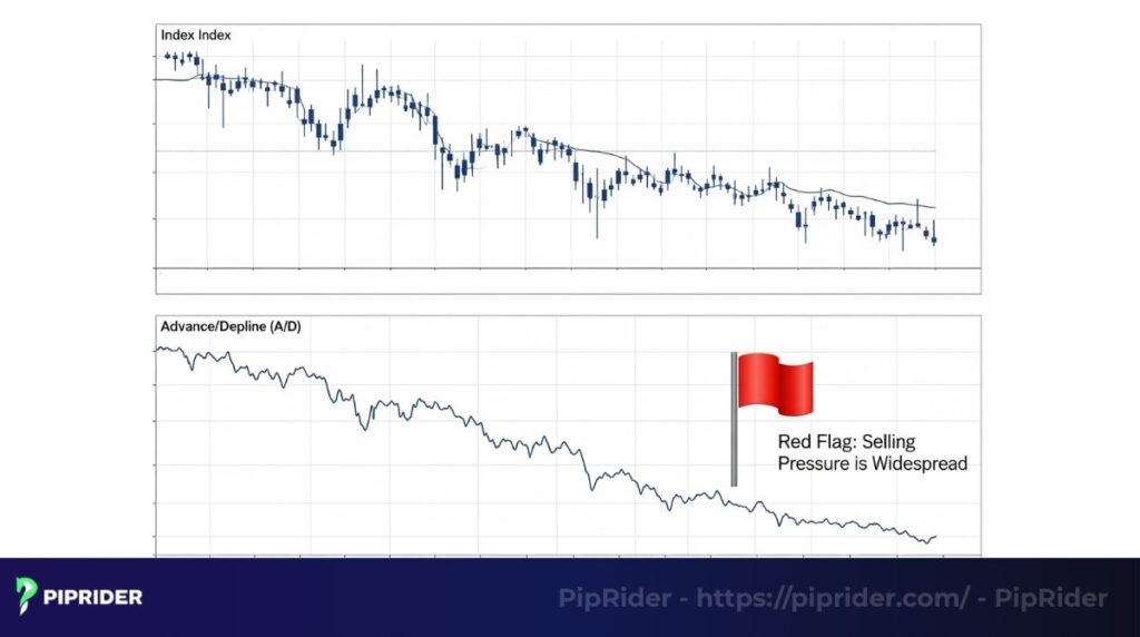
- In a real bear market: The index is clearly trending down, making lower lows. The A/D line is also tumbling downwards. This confirms that the selling pressure is widespread and not just isolated to a few sectors.
Understanding this breadth dynamic is essential when trading stock indices, where the A/D line helps identify whether index gains are supported by broad participation or just a few large-cap stocks.
7.2. Spotting divergences
Divergence is when the price and the indicator tell you two different stories. This is where the A/D line earns its reputation as a legendary market tool.
7.2.1. Bearish divergence
Imagine this common scenario: The bull market has been running for months. Market sentiment is overwhelmingly positive, and the S&P 500 has just climbed to another all-time peak.
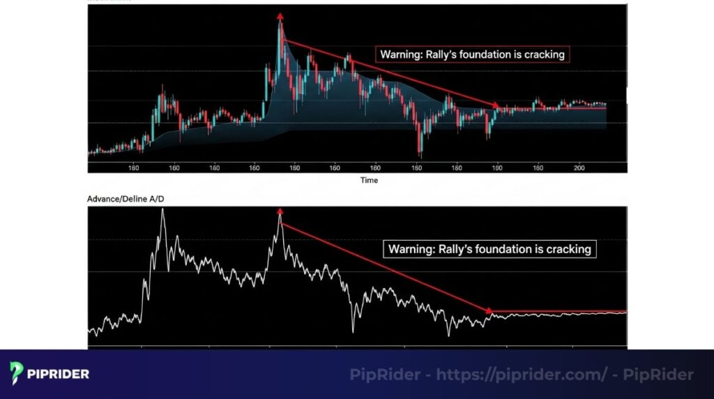
But you pull up the advance decline line. You notice a striking disagreement: the index has pushed to a new record high, but the A/D line has refused to follow, charting a lower high instead.
- What this is telling you: This visual conflict is a classic signal of deep, internal weakness. While a few big-name stocks are doing the heavy lifting to drag the index higher, the average stock is no longer participating. This represents a textbook example of internal decay, signaling that the rally’s structural integrity is becoming compromised.
7.2.2. Bullish divergence
Now, picture the opposite: The market has been in a painful downtrend. Fear is everywhere, headlines are terrifying, and the index just plunged to a new low. Panic selling is in the air.
But the A/D line is telling a different story. As the index plunges to a new, fear-inducing low, the A/D line does something different: it carves out a higher low than its previous one.
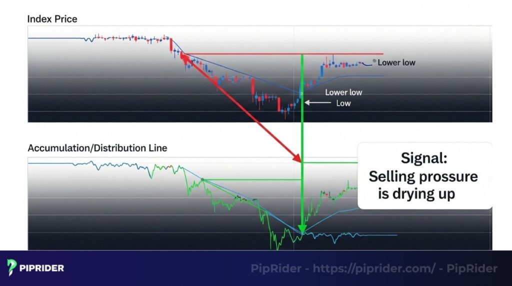
- What this means: Even as the index price falls, the selling pressure is drying up. Fewer stocks are making new lows with the index. This is a subtle sign of “quiet accumulation,” where smart money begins to step in and buy beaten-down stocks. It suggests the worst of the selling may be over, and a base is being built for a potential new uptrend.
8. Real-World Case Study: Spotting the “Silent” Market Collapse
The most dangerous markets are not the ones that are crashing; they are the ones that are rising while the internal foundation is rotting. Let’s look at the classic 2021-2022 divergence—a perfect example of how the A/D Line predicted a massive correction months before it happened.
The Scenario: Late 2021 (The Illusion of Strength)
In the second half of 2021, the headline numbers for the S&P 500 looked incredible. The index was hitting record highs almost every week. To the average investor, it looked like the bull market would never end.
However, professional traders using the NYSE Advance Decline Line saw a much scarier reality:
- The Index Action (Price): According to historical charting data from platforms like TradingView, the S&P 500 continued its rally, eventually hitting a final all-time high in early January 2022.
- The A/D Line Action (Breadth): Despite the index rising, exchange records show the A/D Line had already peaked in November 2021. While the S&P 500 made “Higher Highs,” the A/D Line was making “Lower Highs.”
- The Verdict: A massive Bearish Divergence.
The Silent Warning: “Generals vs. Soldiers”
This divergence revealed that only a few “Generals” (mega-cap tech giants like Apple, Microsoft, and Nvidia) were dragging the index higher. Meanwhile, the “Soldiers” (the other 400+ stocks in the index) were already in a private bear market, quietly declining.
The Result? Because the market breadth had vanished, the S&P 500 became top-heavy and unstable. In early 2022, the support finally snapped, leading to a brutal year-long sell-off. The A/D Line gave savvy traders a 2-month head start to exit their positions before the actual crash began.
PipRider Insight: When the Generals are charging but the Soldiers are retreating, the war is already lost. Always trust the A/D Line over the headline price of the index.
9. When the A/D Line Fails or Misleads
No indicator is perfect. To trade like a professional, you must understand the A/D Line’s blind spots. Here are four scenarios where it can give you false signals:
- Index Weighting (Large-Cap Bias): In cap-weighted indices like the S&P 500, a few massive tech giants can pull the entire index higher while hundreds of smaller stocks decline. The A/D Line will scream “bearish divergence” (because most stocks are dropping), but shorting the market here is dangerous. The heavyweights are legitimately holding the market up, making the A/D Line prematurely bearish.
- Sector Rotation: During healthy bull markets, institutional money often rotates out of one sector (e.g., Tech) and into another (e.g., Utilities). The declining tech stocks might cancel out the advancing utility stocks, causing the A/D Line to flatline or drop. This creates the illusion of market weakness, even though smart money is just repositioning, not exiting.
- Low Participation Periods: During summer months or holiday weeks, trading volume dries up. Without institutional volume driving a clear trend, the daily net advances create choppy, meaningless noise. The A/D Line becomes highly unreliable in these sideways, low-liquidity environments.
- Not Suitable for Forex or Crypto: The Advance Decline Line is strictly a stock market breadth tool. It requires a basket of hundreds of individual equities. You cannot apply this A/D Line to a single Forex pair (like EUR/USD) or a cryptocurrency (like Bitcoin).
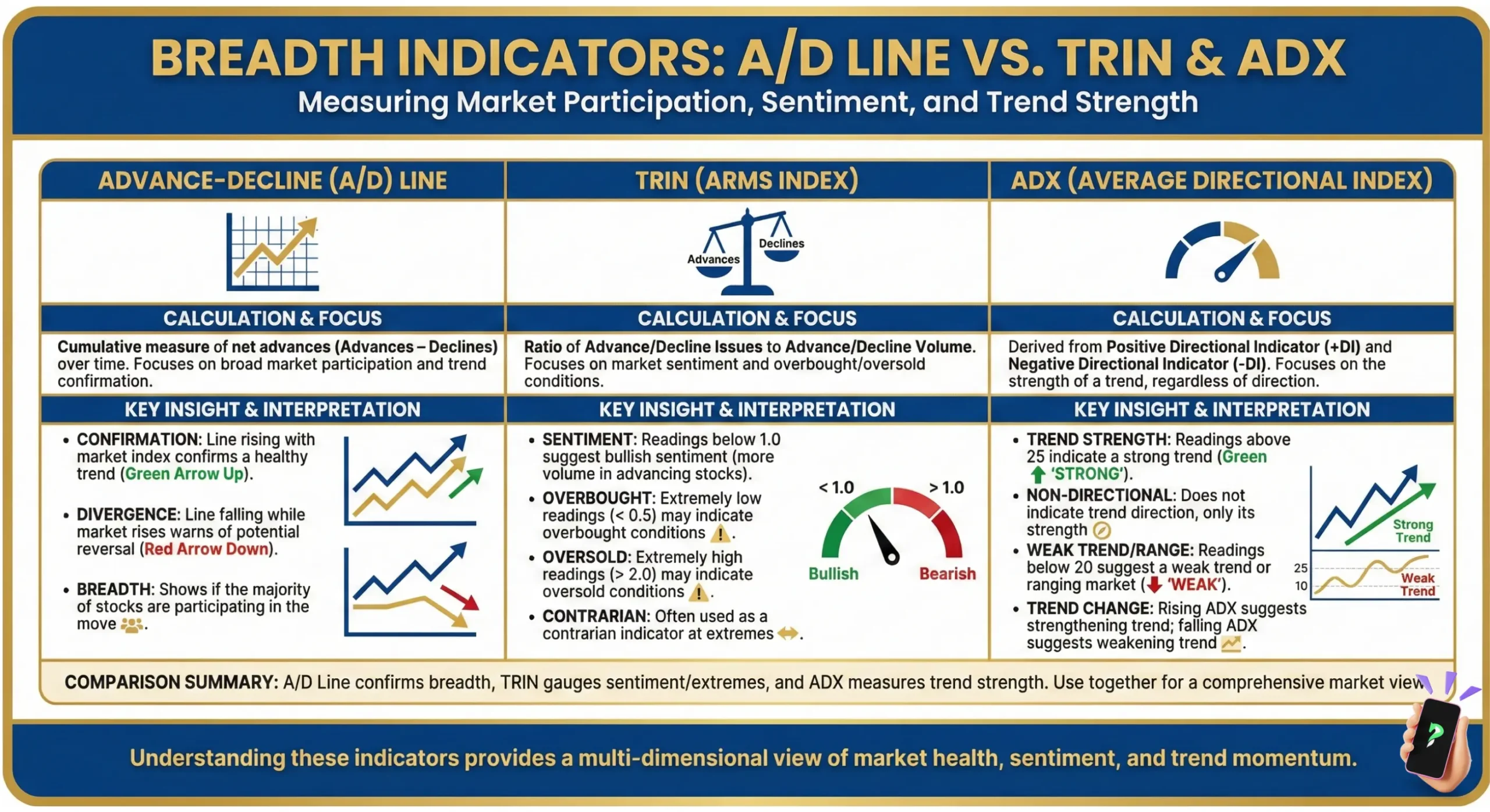
9.1. The Crucial Distinction: A/D Line vs. A/D Indicator
One of the most common and costly mistakes new traders make is confusing the Advance Decline Line with the Accumulation/Distribution (A/D) Indicator created by Marc Chaikin.
While their names are nearly identical, their mechanics and use cases are completely different. The A/D Line looks at the entire forest, while the A/D Indicator looks at a single tree.
Here is the definitive breakdown so you never mix them up:
| Feature | Advance Decline Line (A/D Line) | Accumulation/Distribution (A/D) |
|---|---|---|
| Core Data Used | The net number of advancing vs. declining stocks. | The volume and closing price of a specific asset. |
| Primary Purpose | Market Breadth: Measures the overall health and participation of a market trend. | Money Flow: Measures the buying and selling pressure behind a specific asset. |
| Analytical Scope | Market-Wide: Used exclusively for major indices (S&P 500, NYSE). | Single Asset: Used for individual stocks, Forex pairs, or Cryptocurrencies. |
10. How to Combine the A/D Line With Other Tools
In professional trading, a single indicator is never a “buy” or “sell” signal. To filter out market noise, you must seek confluence—where multiple, independent tools point to the same conclusion.
10.1. A/D Line + S&P 500 (The Divergence Hunter)
This is the most fundamental pairing. You are essentially comparing the “Surface” (S&P 500 Price) with the “Foundation” (A/D Line Breadth).
- The Logic: The S&P 500 is market-cap weighted (heavy bias toward Big Tech). The A/D Line is equal-weighted.
- The Signal: Look for Non-Confirmation. If the S&P 500 breaks a major resistance level to hit a new high, but the A/D Line fails to break its own previous peak, the move is “hollow.” This is a classic Bull Trap.
- Action: If price breaks out but breadth doesn’t, reduce your long positions and tighten stop-losses.
10.2. A/D Line + Moving Averages (The Trend Smoother)
The A/D Line can be “choppy” day-to-day. Applying a Moving Average (MA) directly to the indicator line helps you identify long-term structural shifts.
- The Pro Setup: Apply a 50-day or 200-day Simple Moving Average (SMA) to the A/D Line.
- The Signal: A “Breadth Crossover.” When the A/D Line crosses above its 200-day SMA, it signals a major cyclical shift from a Bear to a Bull market. This often happens weeks before the actual S&P 500 index price confirms a new uptrend.
- Action: Use the 200-day MA crossover on the A/D Line as a “Macro Green Light” to start looking for aggressive long setups.
10.3. A/D Line + Volume (The Force Factor)
Breadth tells you how many stocks are moving; Volume tells you how much conviction is behind those moves.
- The Logic: A “Breadth Thrust.” This occurs when the A/D Line surges higher alongside a massive spike in buying volume.
- The Signal: If the A/D Line is rising but Trading Volume is declining, the rally is losing fuel. This is “exhaustion.” Conversely, if both spike together, it confirms that institutions (Smart Money) are aggressively accumulating shares across all sectors.
- Action: Only “Trust the Trend” when the A/D Line and Volume Trend are moving in the same direction.
Pro Tip: In modern markets, look for the NYSE Up/Down Volume ratio alongside the A/D Line. If the A/D Line is positive (+1000) and the Up/Down Volume is also high (e.g., 9:1), you are witnessing a “90% Up Day”—one of the strongest bullish signals in technical analysis.
11. Frequently asked questions about advance decline line
12. Conclusion: A new way to see the market
The advance decline line is more than just a technical tool; it’s a fundamental shift in perspective. It trains you to look beyond the distracting headlines and focus on the true, internal health of the market.
By mastering the simple arts of trend confirmation and divergence, concepts that might have seemed complex at first, any trader, including a dedicated beginner, can learn to spot major market turning points with greater clarity.
By incorporating the A/D line into your routine, you stop just following price and start understanding the powerful story the market is truly telling—a breadth-based approach that complements other technical analysis strategies for comprehensive market insight.
Don’t forget to follow piprider.com to learn more useful knowledge about technical indicators, ranging from beginner fundamentals to advanced strategies.
Infographic Section
-
Advance Decline Line (A/D Line) -
Advance Decline Line: Trend Confirmation and Divergence -
Breadth Indicators: A/D Line Vs. Trin Vs. ADX