If you’ve ever watched a stock’s price stall or reverse without any obvious reason, you’ve felt the frustration of missing a key piece of the puzzle. That missing piece is often volume. The Accumulation Distribution Indicator is a technical tool designed specifically to interpret that volume, giving you a look “under the hood” of price action.
This guide isn’t just a technical breakdown. It’s a strategic manual built on years of watching this indicator in live markets. Piprider will explore how the accumulation distribution indicator can help you distinguish between a weak price move and one backed by conviction, a skill that can fundamentally change how you view trends.
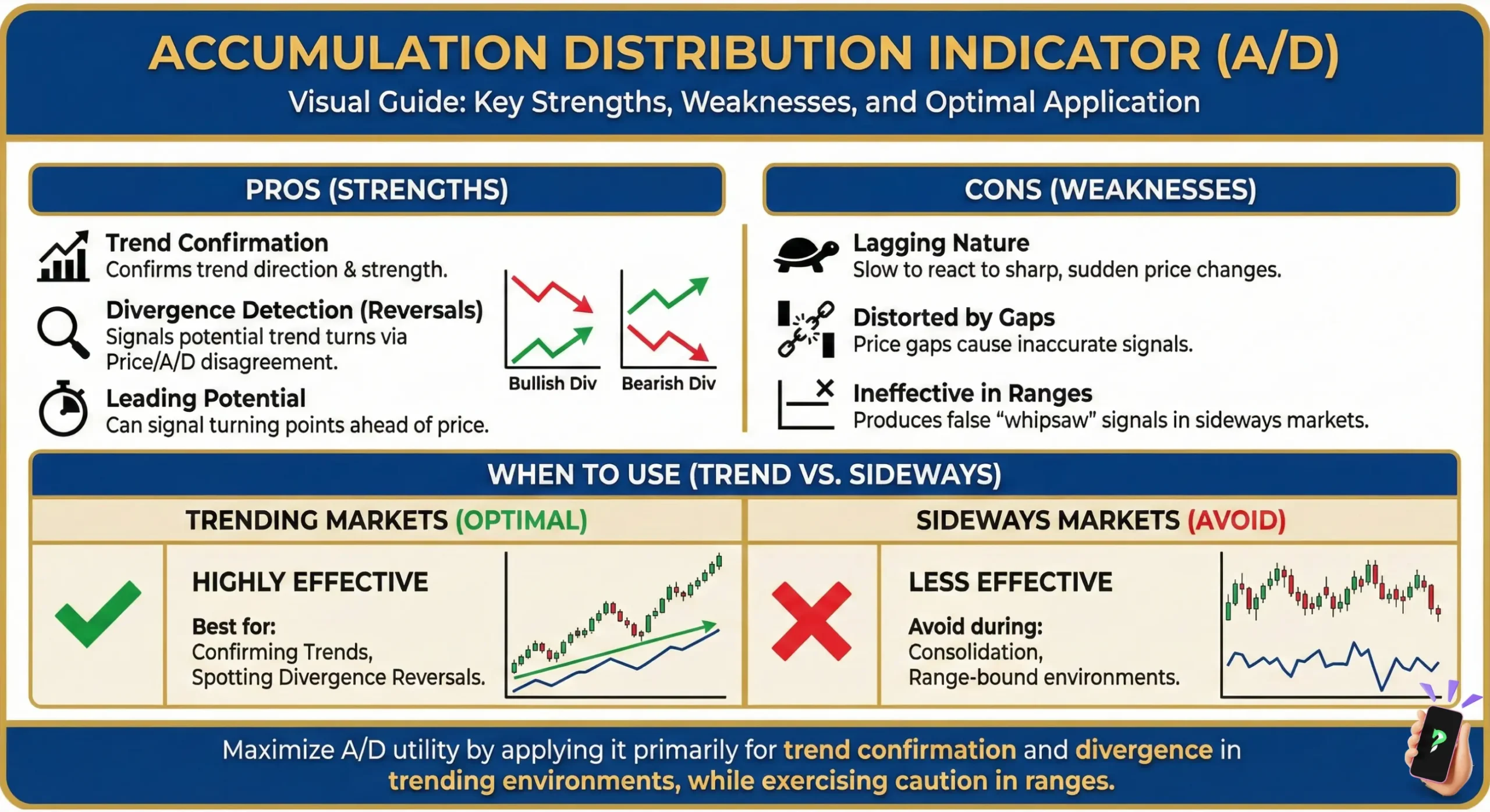
Key Takeaways
- Tracks cumulative volume to gauge underlying buying (accumulation) or selling (distribution) pressure.
- Calculates flow based on the close within the session’s high-low range, weighted by volume.
- A rising A/D line supports an uptrend’s health; a falling line confirms downtrend pressure.
- Its main strength is identifying divergence (price vs. A/D moves), signaling potential reversals early.
- Ignores price gaps, which can sometimes distort the money flow reading.
1. What is the accumulation distribution indicator?
The Accumulation Distribution (A/D) Indicator is a volume-based technical tool designed to measure the underlying buying and selling pressure in a market. Developed by Marc Chaikin, it goes beyond simple price action by incorporating volume to gauge whether an asset is being accumulated (bought) or distributed (sold), particularly by institutional players.
Essentially, the A/D line helps traders see the conviction behind price moves. A rising line suggests strong buying pressure (accumulation), while a falling line indicates selling pressure (distribution).
- Accumulation: This is the act of buying, but not just any buying. It’s the smart money building a position, often quietly, without causing a massive price spike. The A/D line rises when it detects this. This is a strong sign that institutional capital is flowing into the asset.
- Distribution: This is when those same large players begin to sell off their holdings. They might sell into a rising price to maximize profit, a subtle action that the A/D line is designed to detect, often before the price turns.
Think of it as seeing the powerful current beneath the ocean’s surface. Price tells you where the market has been, but the A/D line tells you about the force driving it.
2. The formula that powers the A/D indicator
You’ll never need to calculate this manually; your charting software does it instantly. But the real edge comes from understanding the why behind the calculation, a step that separates a casual chart reader from a serious analyst.
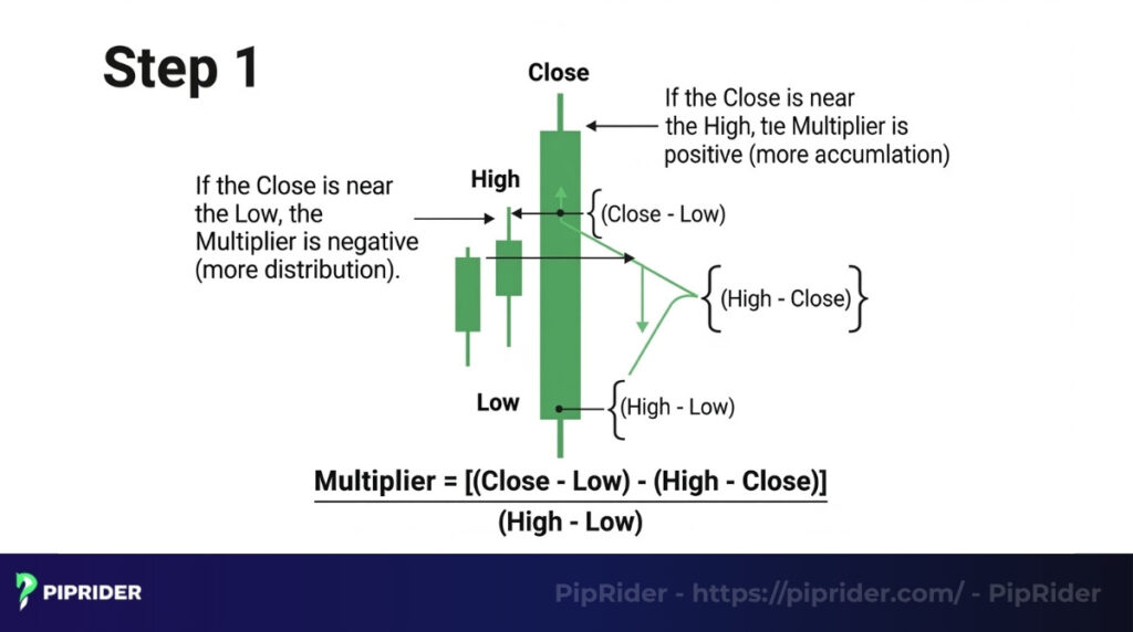
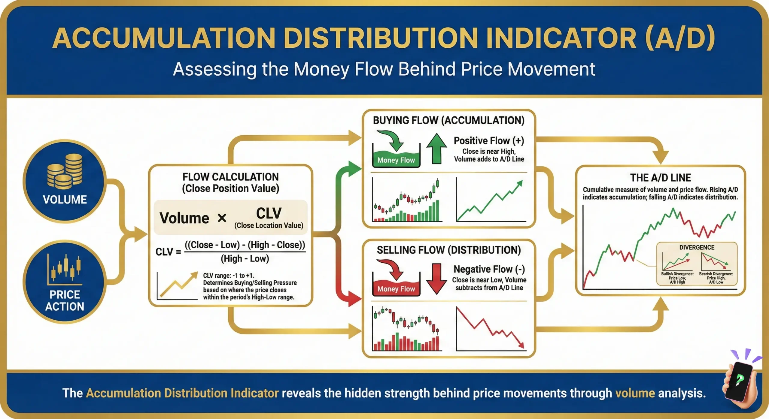
2.1. Step 1: Calculate the money flow multiplier
This first step is the engine of the indicator. It asks a simple question: “Where did the price close relative to its range for the day?”
Multiplier = [(Close – Low) – (High – Close)] / (High – Low)
If the stock closes near its high, the multiplier will be positive. If it closes near its low, it will be negative. A close right in the middle results in a zero. It’s a brilliant way to quantify a session’s buying or selling pressure.
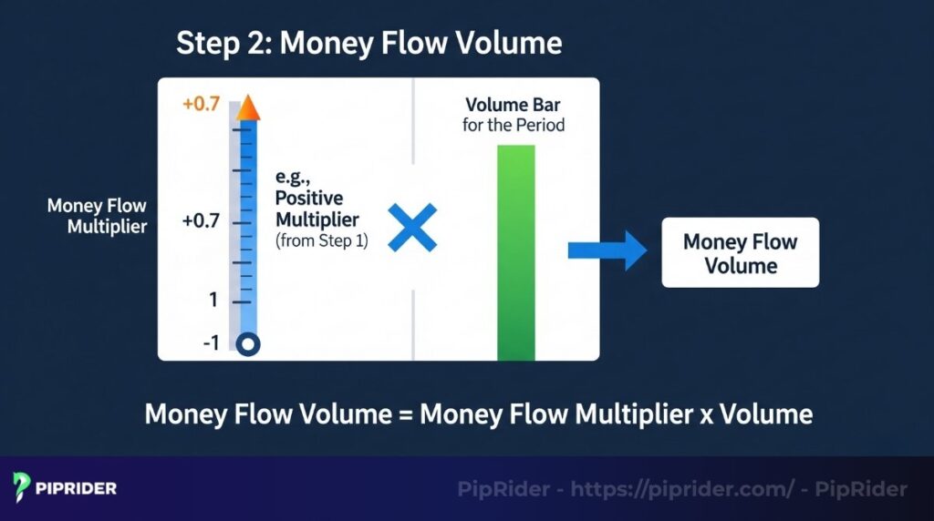
Step 2: Determine the money flow volume
This step connects the pressure reading from Step 1 to the session’s actual volume. A high-conviction day (a strong close with high volume) will have a much greater impact than a low-conviction day. The calculation is:
Money Flow Volume = Money Flow Multiplier x Volume for the Period
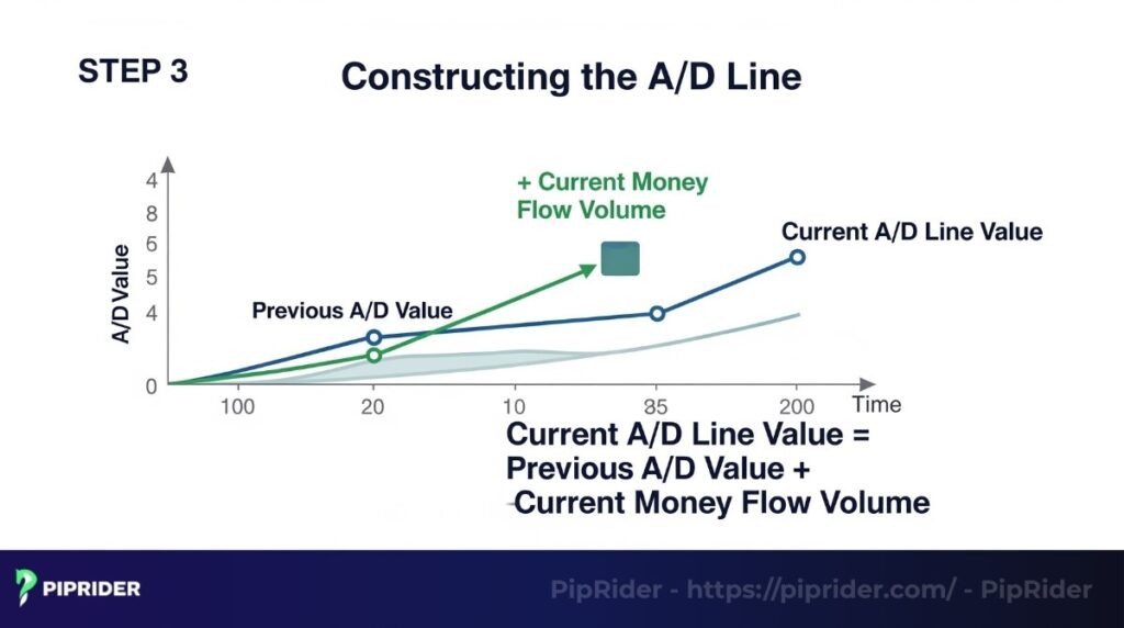
Step 3: Construct the A/D line
Finally, the A/D line itself is just a cumulative total of the Money Flow Volume, creating a running tally that shows the overall trend of money flow over time. The line is formed using this logic:
Current A/D Line Value = Previous A/D Value + Current Money Flow Volume
3. How the accumulation/distribution indicator works
Now, let’s get practical. Interpreting the A/D line is like learning to read the market’s body language.
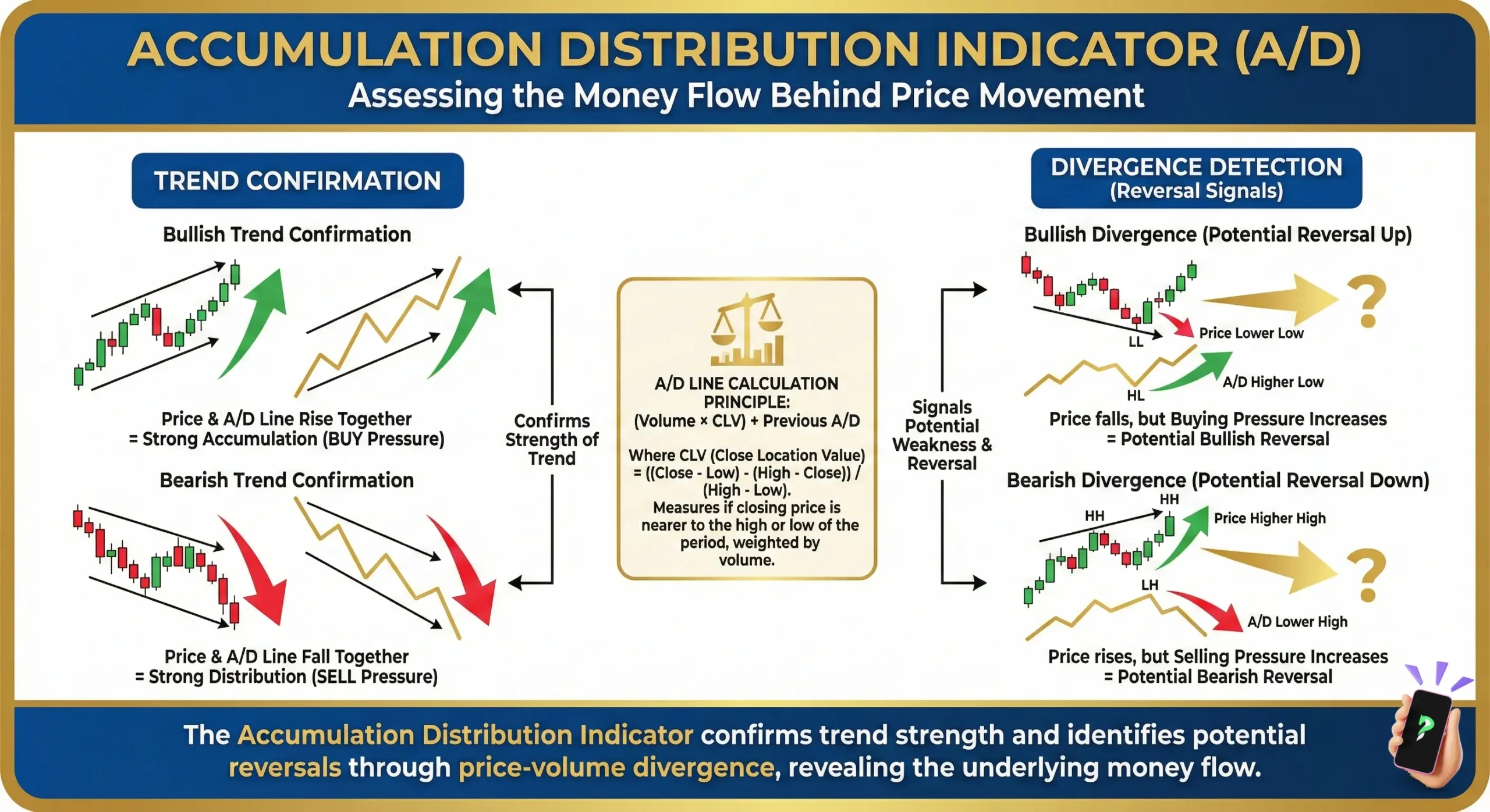
3.1. Interpreting the slope
The direction of the A/D line is your first clue. Think of the price as the surface of the ocean and the A/D line as the powerful undercurrent.
- An upward-sloping A/D line shows a strong buying undercurrent. Even if the price on the surface is choppy, rising A/D suggests conviction from buyers.
- A downward-sloping A/D line reveals a selling undercurrent. This is a warning sign, especially if the price is still trying to climb.
3.2. The core relationship: Price vs. the A/D line
The most profound insights come from comparing the surface (price) to the undercurrent (A/D).
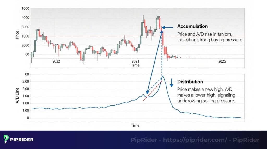
- Confirmation: This occurs when both the price and the A/D line are telling the same story, validating the trend’s health. For instance, a new price peak that is matched by a new A/D peak serves as a powerful signal of bullish strength. This harmony is precisely the green light you look for when you’re in a position.
- Divergence: This is when the price and A/D tell different stories. It’s the market’s most important “tell,” and learning to spot it has been one of the most valuable skills in my trading career.
4. Applying the A/D indicator: Practical strategies
Let’s move from theory to application with two battle-tested strategies.
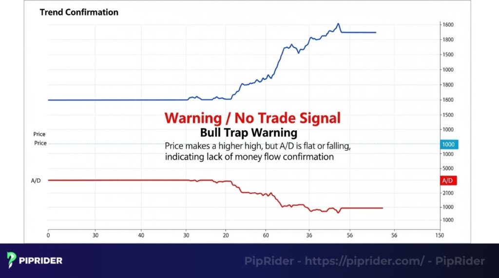
4.1. Strategy 1: Trend confirmation
One of the most reliable ways to use the A/D indicator is for trend confirmation.
Before entering a long trade during an established uptrend, traders should check the A/D line.
- If the price is making higher highs and the A/D line is also making higher highs, it confirms the uptrend has strong underlying buying pressure.
- However, if the price is making higher highs, but the A/D line is flat or falling (showing bearish divergence), it signals that the trend might lack conviction. In this scenario, experienced traders often avoid taking the long trade, as it could be a potential “bull trap.”
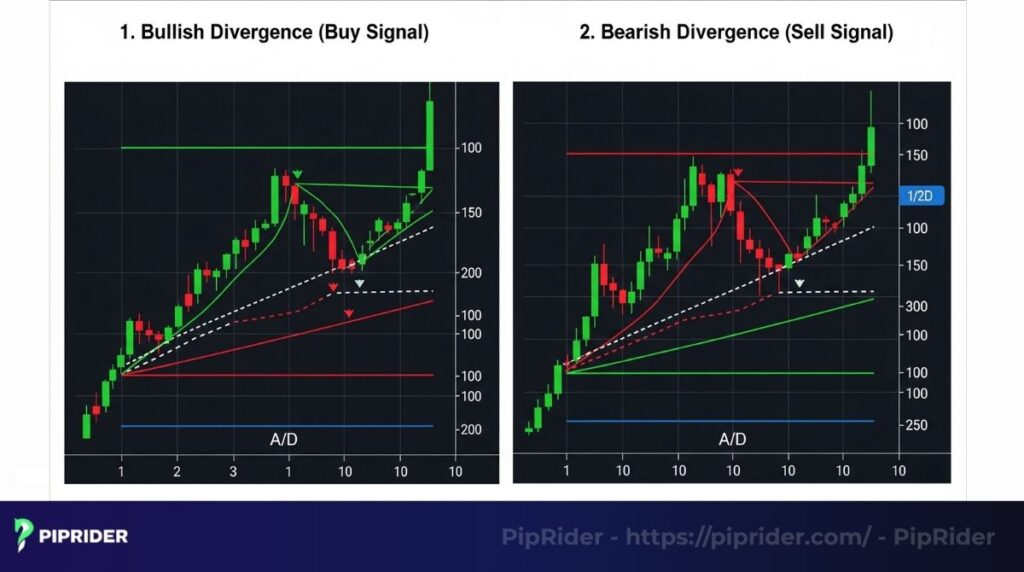
4.2. Strategy 2: Trading with divergence
Divergence is where the A/D indicator truly shines. It’s a leading signal that momentum is shifting before the price reflects it.
- Bullish Divergence (A Buy Signal):
The price chart shows a stock hitting a new, lower low, causing panic. But you look at the A/D line and see it has formed a higher low. This is the signal: the sellers are exhausted, and smart money is starting to accumulate at these cheap prices. It’s a signal of quiet confidence. - Bearish Divergence (A Sell Signal):
The price pushes to a glorious new high, and retail traders are euphoric. But the A/D line fails to reach a new peak, instead carving out a lower high. This is a subtle signal that the bullish party may be winding down.
5. Examples of the A/D line in action
Real-world chart examples illustrate how the Accumulation/Distribution line provides practical insights into market dynamics.
5.1. Example 1: Confirming a strong uptrend
A trader recalls a clear case from his trading journal involving a stock that was finally emerging from months of sideways consolidation. The breakout was on good volume, which was nice, but the A/D line was also breaking its own downtrend and surging upwards. This confirmation gave me the confidence to hold the position through minor pullbacks, as he knew the underlying money flow was exceptionally strong.
5.2. Example 2: Catching bearish divergence before a decline
A classic example was a popular growth stock that had rallied over 100%. As it pushed its final 10% to a new peak, a trader noticed the A/D line was slumping badly. This was a massive red flag. While everyone else was celebrating, the divergence signaled it was time to sell. The stock corrected over 30% in the following months.
5.3. Example 3: Identifying bullish divergence for a buy opportunity
During a market correction, a trader was watching a blue-chip stock get hammered. It dropped to a new 52-week low. But the A/D line was stubbornly refusing to follow it down, carving out a higher low. Looking back at his journal, that bullish divergence was the definitive signal that pinpointed the stock’s absolute turning point.
6. A/D vs. On-Balance Volume (OBV): a practical comparison
Many traders group these two volume indicators together, but in practice, they measure very different things. Understanding this difference is key to knowing which tool to use for the job.
Let’s break it down with a clear example.
Imagine this trading day:
- Yesterday’s Close: $100
- Today’s High: $105
- Today’s Low: $98
- Today’s Close: $101
- Today’s Volume: 500,000 shares
6.1. On-Balance Volume (OBV) – The “Big Picture” Momentum
How it thinks: “Did the price close higher or lower than yesterday?” It focuses solely on the change between closing prices from one day to the next.
Its calculation, for example:
- Today’s Close ($101) is higher than Yesterday’s Close ($100).
- Therefore, OBV adds the entire volume for today (500,000 shares) to its previous running total.
Result: The OBV line will increase by 500,000. It sees this day as a sign of accumulation (buying pressure) because the price closed higher than the previous day, regardless of where it closed within today’s range.
6.2. Accumulation Distribution (A/D) Line – The “Intraday” battle
How it thinks: “Where did the price close within its own trading range for the day?” It completely ignores yesterday’s close.
Its calculation, for example:
The stock closed at $101, which is much closer to the low ($98) than the high ($105). This is a sign of weakness; buyers tried to push it up, but sellers forced it back down. The Money Flow Multiplier will be negative.
Result: The A/D line will decrease, subtracting a portion of the 500,000 volume from its total. It sees this day as a sign of distribution (selling), despite the green close.
6.3. Final verdict: which one to use?
- Use OBV for analyzing the long-term, big-picture trend momentum. It’s excellent for confirming broad market direction over weeks or months.
- Use the A/D Line to get a more nuanced, “inside look” at market sentiment. It is far superior for spotting divergences and understanding if a price move has real conviction behind it. From my experience, the A/D is the better tool for active swing trading.
7. Advantages and limitations of the A/D indicator
Understanding the specific strengths and weaknesses of the Accumulation/Distribution (A/D) indicator is key to applying it effectively.
7.1. Advantages
The A/D line offers several benefits compared to basic volume analysis:
- Deeper volume insight: Provides a more nuanced view of buying/selling pressure than simple volume bars by considering the closing price within the daily range.
- Leading signal potential: Divergence between the A/D line and price can offer early warnings of potential trend reversals.
- Trend confirmation: Acts as a useful filter; trends supported by the A/D line inspire greater confidence.
7.2. Limitations
However, traders must also be aware of its inherent drawbacks:
- Ignores price gaps: The calculation does not account for overnight or opening gaps, focusing only on the intraday range. This can sometimes misrepresent the actual money flow after a significant gap. गैप
- Less reliable in choppy markets: Like many indicators, the A/D line can generate conflicting or misleading signals during sideways, range-bound market conditions.
8. Frequently asked questions about accumulation distribution indicator
9. Conclusion: The key to using the A/D successfully
The Accumulation Distribution Indicator is more than just a line on a chart; it’s a window into the market’s true intentions. By learning to interpret its signals, you move beyond being a reactive trader who just follows price and become a proactive analyst who understands the forces driving it.
Your goal is to master two things: using it to confirm the health of a trend and patiently hunting for high-conviction divergence signals. When you combine these skills, the A/D indicator transforms from a simple tool into an invaluable ally, helping you make more informed and confident trading decisions.
Ready to elevate your trading game with in-depth market knowledge? Dive into Piprider to discover the best technical indicators and advanced strategies.
Infographic Section
-
Accumulation Distribution Indicator -
Accumulation Distribution Indicator: Price movement -
Accumulation Distribution Indicator: Pros and Cons