The death cross pattern is a famous bearish signal that traders and investors watch closely in the stock market. It occurs when a short-term moving average (like the 50-day) crosses below a long-term moving average (like the 200-day). This cross signals a potential major shift from a bull market to a bear market.
This guide provides a complete breakdown of how to read the death cross pattern, why it’s a lagging indicator, and the strategies you can use to trade it.
Key Takeaways
- A death cross pattern occurs when the 50-day Moving Average crosses below the 200-day Moving Average.
- It warns of strong bearish momentum and the potential start of a long-term downtrend.
- The Death Cross does not always lead to a crash; it needs confirmation to avoid false signals.
- It works best when combined with volume, market structure, or indicators like RSI and MACD.
- Popular strategies include trend-following, selling on a pullback, or trading a breakout.
1. What Is the Death Cross Pattern?
A death cross is a bearish technical market chart pattern that occurs when a security’s short-term moving average (specifically the 50-day moving average) crosses below its long-term moving average (the 200-day moving average).
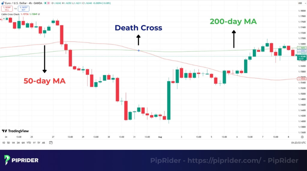
This crossover signals a potential long-term trend reversal, indicating that market sentiment has shifted from bullish (positive) to bearish (negative).
The signal is triggered at the exact moment when the 50-day moving average drops below the 200-day moving average:
SMA 50 < SMA 200
While these specific averages are the standard, some traders use variations like the 10-week and 40-week averages on weekly charts.
Investors view this pattern as a major warning sign because the 200-day moving average is considered the “line in the sand” for the long-term trend. When momentum drops below this line, it confirms that sellers have taken control. Historically, this pattern appeared before major market crashes like 1929 and 2008 (Corporate Finance Institute, n.d.).
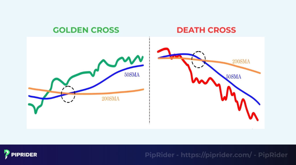
Death Cross vs. Golden Cross
To understand the death cross, it helps to know its opposite, the golden cross.
- Death cross: 50-day MA crosses below the 200-day MA (Bearish Signal).
- Golden cross: 50-day MA crosses above the 200-day MA (Bullish Signal).
While the Golden Cross signals the start of a bullish market, the death cross warns of a potential bear market.
2. What Does the Death Cross Tell Traders?
The death cross pattern is more than just two lines crossing on a chart. It tells a deeper story about the underlying market psychology, signaling that short-term weakness is evolving into a long-term problem.
- Confirmation of a bearish trend: The primary message is that bearish market momentum is accelerating. Since the 50-day moving average (short-term moving average) has fallen below the 200-day moving average (long-term trend), it confirms the downtrend is now the dominant force.
- Weakening demand: This pattern signals that buyers are stepping away. During a bull market, investors rush to “buy the dip.” A death cross suggests this support has vanished, and investors are no longer willing to buy at current prices.
- Increased selling pressure: The crossover often coincides with a spike in trading volume. This indicates that institutional investors (like mutual funds) are exiting large positions to protect their portfolios, driving prices down further.
- Market sentiment shift: Finally, the death cross marks a shift from “greed” to “fear”. As the pattern appears in news headlines, it can create a negative feedback loop where fear drives more selling, pushing the market into a prolonged bearish phase.
3. How to Identify the Death Cross Pattern (Step-by-Step)
Identifying a death cross on your chart requires two specific moving average indicators. Follow these five steps to accurately locate and validate the signal.
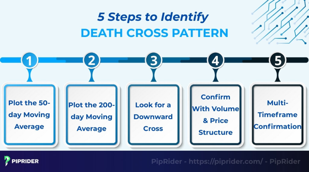
3.1. Step 1: Plot the 50-day Moving Average
Start by opening your chart to the daily timeframe. Add a Simple Moving Average (SMA) indicator and set the length to 50. This line tracks the asset’s short-term trend and recent momentum.
Pro Tip: While the classic Death Cross strictly uses Simple Moving Averages (SMAs), some traders use Exponential Moving Averages (EMAs) to reduce lag. However, for identifying long-term structural shifts, the 50 SMA remains the industry standard.
3.2. Step 2: Plot the 200-day Moving Average
Next, add a second Simple Moving Average and set the length to 200. Choose a distinct color (like red or black) to differentiate it. This line represents the core long-term trend. In traditional technical analysis, the 200-day SMA is widely monitored as a primary baseline for macroeconomic momentum.
3.3. Step 3: Look for the Downward Intersection
Scan the chart for the specific moment when the 50-day SMA decisively crosses below the 200-day SMA. This intersection is the actual “death cross.”
Note on Price Action: Because moving averages are lagging indicators by nature, the actual asset price will typically already be trading below both averages by the time this visual crossover occurs.
3.4. Step 4: Confirm With Volume & Price Structure
Do not rely on the cross alone. Check the volume at the time of the crossover; expanding volume suggests stronger market participation and gives the signal more weight. Furthermore, verify that the price action is forming lower highs and lower lows (a bearish market structure).
Note for Forex Traders: Because the spot Forex market is decentralized, trading platforms provide “tick volume” (the frequency of price updates) as a proxy rather than actual capital flow. Therefore, FX volume should be treated as a secondary filter. Always prioritize clear support breaks and price structure over volume spikes when validating a death cross in Forex.
3.5. Step 5: Multi-Timeframe Confirmation
Finally, apply a top-down approach by zooming out to the weekly chart. Check if the price is also trading below key weekly moving averages (such as the 40-week SMA, which approximates the 200-day SMA). If the weekly chart confirms a broader downtrend, it adds significant confluence to the daily signal, reducing the likelihood of a false breakdown.
📋 The Pre-Trade Checklist: Is This Death Cross Valid?
Before executing any of the strategies below, ensure your chart meets these 6 strict criteria to avoid costly bear traps:
- [ ] The Crossover: The Daily 50-period MA has cleanly crossed below the 200-period MA.
- [ ] Price Location: The current price action is trading strictly below the 200-day MA.
- [ ] Market Structure: The asset is printing a confirmed sequence of Lower Highs (LH) and Lower Lows (LL).
- [ ] Trend Strength: The ADX indicator is reading > 20, confirming the market is not stuck in a choppy range.
- [ ] Price Confirmation: The price has decisively broken and closed below a key historical support level.
- [ ] Risk Plan: Stop-Loss (SL), Take-Profit (TP), and exit rules are strictly defined before entry.
4. How to Trade the Death Cross Pattern (The Playbook)
Trading a death cross is not as simple as “sell when the lines cross”. Because it is a lagging indicator, the price is often already oversold when the cross happens. To profit, professional traders use structured playbooks that wait for optimal entry triggers and define strict risk management rules.
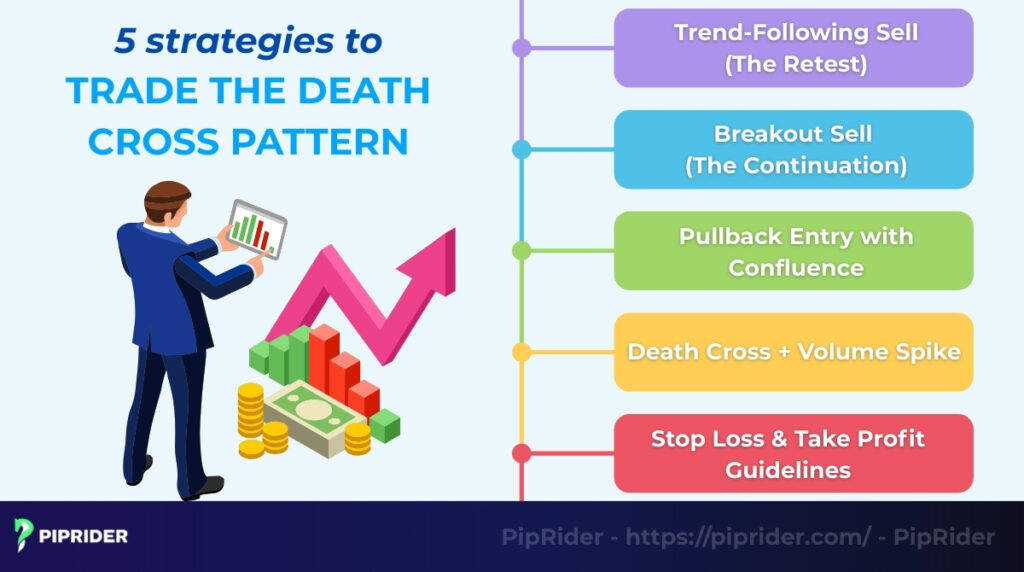
4.1. Strategy 1: Trend-Following Sell (The Retest)
Instead of selling immediately at the cross, this safer approach waits for the price to pull back and retest the moving averages.
- Entry Trigger: Wait for a bearish rejection candle (e.g., a pin bar or engulfing candle) to close at or near the 50-day MA, while the price remains strictly below the 200-day MA.
- Stop-Loss (SL): Place just above the recent swing high or above the 50-day MA, plus an ATR (Average True Range) buffer.
- Take-Profit (TP): Target TP1 at the nearest major historical support level. Scale out for TP2 using a 2x or 3x ATR multiple.
- Exit Rule: Manually exit the trade early if a daily candle closes back above the 50-day MA, or if MACD/RSI show a bullish reversal.
- Invalidation: The setup is completely invalidated if the price breaks market structure by printing a distinct Higher High (HH) on the Daily chart.
4.2. Strategy 2: Breakdown Sell (The Continuation)
Sometimes the price consolidates sideways after a death cross, forming a “bear flag”. Waiting for a deep pullback here might cause you to miss the move.
- Entry Trigger: Enter only after a decisive daily break and close below the post-cross support level. Do not enter prematurely on an intraday wick (shadow).
- Stop-Loss (SL): Place safely above the breakdown level or the most recent swing high within the consolidation range.
- Take-Profit (TP): Target the measured move of the preceding range/bear flag, aligned with the next historical support zone.
- Exit Rule: Manually exit if the price breaks back into and closes above the previous consolidation range (a “Failure to Hold” pattern).
- Invalidation / No-Trade Zone: Avoid this setup entirely if the ADX indicator is reading below 20 (indicating a choppy, ranging market prone to false breakouts).
4.3. Strategy 3: Pullback with Confluence
This advanced strategy uses confluence tools to find a precise entry during a corrective rally, filtering out false signals.
- Entry Trigger: Enter only after a bearish confirmation candle closes within a confluence zone (e.g., price hits a Fibonacci/trendline + forms a structural Lower High + RSI remains < 50).
- Stop-Loss (SL): Place safely above the local swing high or the confluence zone, plus an ATR buffer.
- Take-Profit (TP): Target TP1 at the nearest major historical support level; TP2 based on ATR multiples (same as Strategy 1).
- Exit Rule: Manually exit if a daily candle closes above the confluence zone or if momentum indicators reverse.
- Invalidation: The setup is invalidated if the price breaks market structure by printing a distinct Higher High (HH) on the Daily chart.
4.4. Strategy 4: The Participation Filter
Rather than a standalone entry, analyzing volume acts as a critical filter to confirm whether the crossover is backed by significant market interest.
- The Logic: Unusually high volume during the crossover suggests that larger market participants are actively repositioning, increasing the probability of a sustained downtrend.
- Data Selection: Always use the highest-quality volume data available (Stocks, ETFs, Futures).
- FX & CFD Note: If trading decentralized CFDs or Spot Forex, prioritize correlating the move with currency futures volume data, or analyze broader market breadth, as broker tick volume is merely a proxy.
5. How to Confirm the Death Cross With Indicators (Confluence)
Because the death cross is a lagging indicator, using it alone can be risky. Professional traders use “confluence in trading“ (combining the cross with other momentum indicators) to filter out false signals and confirm the strength of the downtrend.
Here is a quick confluence cheat sheet:
| Indicator | Required Signal | Why It Matters |
|---|---|---|
| RSI | Below 50 | Confirms bearish momentum is dominant. |
| MACD | Bearish Crossover | Confirms the speed of the selling pressure. |
| ADX | Above 25 | Confirms the trend is strong enough to trade. |
| S/R Level | Support Break | Confirms actual price action matches the MAs. |
5.1. Death Cross + RSI (Momentum Check)
Using the Relative Strength Index (RSI) helps verify if the market truly possesses the bearish momentum required to sustain a downtrend, or if the moving average crossover is just a delayed reaction to an old move.
- The Sweet Spot (RSI 30–50): When the death cross occurs, the RSI should ideally be reading below the 50 midline but above 30. This confirms that sellers are in control, yet there is still “room to fall” before the market becomes overextended.
- The Warning Sign (RSI > 50 or < 30): If the RSI remains above 50 during the cross, buyers are still actively defending the price. Conversely, if the RSI is deeply “oversold” (below 30), it implies the downward move is already exhausted. Entering a short position here greatly increases the risk of getting caught in a mean-reversion bounce.
5.2. Death Cross + MACD (Trend Confirmation)
The Moving Average Convergence Divergence (MACD) is an excellent leading indicator compared to the 50/200 MAs. Because the MACD measures the relationship between shorter-term moving averages (typically 12 and 26), it can forecast the larger 50/200 crossover before it happens.
- The Ideal Setup: You want to see the MACD line cross below its signal line (a bearish crossover) and dip below the zero line slightly before or at the exact same time as the Death Cross. This confirms accelerating selling pressure.
- The Divergence Trap: If the MACD histogram is rising (making higher highs or higher lows) while the 50/200 Death Cross is forming, it signals a “Bullish Divergence.” Be very careful—this means the underlying selling momentum is actually weakening, and the Death Cross is likely a lagging “ghost” signal.
5.3. Death Cross + ADX (Strength Check)
The Average Directional Index (ADX) is the ultimate filter for moving average strategies. Moving averages perform terribly in sideways markets, generating multiple false signals. The ADX solves this by measuring the raw strength of a trend, regardless of its direction.
- The Trending Phase (ADX > 25): A death cross is only actionable if the market is in a confirmed trend. An ADX reading above 25 confirms that the bearish momentum is strong enough to push the price lower.
- The Chop Zone (ADX < 20): If the ADX is resting below 20, the market is simply ranging sideways. In this low-volatility environment, the 50-day and 200-day lines will flatline and cross each other repeatedly. Any Death Cross occurring here should be ignored as a high-probability “whipsaw.”
5.4. Death Cross + Support Break (Price Action)
While RSI, MACD, and ADX are mathematical derivatives of price, structural support and resistance represent actual market psychology and liquidity. Therefore, Price Action is the most powerful confirmation of all.
- The Bias vs. The Trigger: Do not sell simply because the moving averages crossed. The Death Cross only provides a bearish bias (a reason to look for short setups). The actual entry trigger must come from the price decisively breaking and closing below a key historical support level.
- Avoiding the Bounce: Often, the 200-day MA crossover happens exactly when the price hits a major support floor. Selling blindly at the cross means you are selling right into a demand zone where institutional buyers are waiting to accumulate.
6. What Are the Common Mistakes Traders Make With the Death Cross?
The death cross pattern is a powerful signal, but it is often misunderstood as an immediate “sell” trigger. Most trading losses come from ignoring context like volume, market conditions, or the lagging nature of moving averages, and reacting emotionally rather than strategically.
- Assuming an immediate crash: Death cross is a lagging indicator. By the time the cross happens, the price has often already dropped significantly. Expecting an instant crash can lead to selling at the exact moment the market bounces.
- Trading without volume: Volume validates the trend. A crossover on weak volume suggests institutions aren’t selling, increasing the risk of a false signal.
- Entering too early: Selling before the lines actually cross is gambling. The lines can touch and bounce apart (a “kiss”), leaving you short during a rally.
- Ignoring market structure: Selling blindly at the cross is dangerous if the price is sitting on major support. Always check if there is a “floor” under the price.
- Using MAs in sideways markets: Moving averages fail in ranging markets. If the price is going sideways, the 50 and 200 lines will cross repeatedly, generating costly “whipsaw” signals.
7. What Are Historical Examples of the Death Cross?
History shows that the death cross pattern is a powerful but mixed signal. Sometimes it predicts a major crash, and other times it marks a temporary market correction. Here are three famous examples that show different outcomes.
7.1. S&P 500 Death Cross (2008 Financial Crisis)
The death cross in January 2008 is the classic example of why this pattern is feared. The 50-day MA crossed below the 200-day MA just as the housing crisis was beginning.
- The result: After the cross, the S&P 500 continued to plummet for more than a year, eventually losing over 50% of its value by the bottom in March 2009 (FRED, 2023; Chen, 2025). Traders who sold at the cross protected themselves from devastating losses.
7.2. Bitcoin Death Cross (June 2021)
Cryptocurrencies are more volatile, and their signals can be faster. In June 2021, Bitcoin formed a clear death cross after falling from its $64,000 peak (Al Jazeera, 2021).
- The result: This signal marked a period of consolidation rather than a multi-year crash. While the price remained suppressed for a few months, it did not collapse. By October 2021, Bitcoin had formed a “Golden Cross” and rallied to new all-time highs. This shows that in volatile markets, the signal can be short-lived.
7.3. Tesla Death Cross (The Bear Trap)
On July 9, 2021, Tesla (TSLA) triggered a widely publicized Death Cross when trading around $656 (Business Insider, 2021). However, this proved to be a classic ‘Bear Trap.’
- The result: Since the indicator was lagging, the cross occurred long after the stock had already bottomed in May. Instead of crashing, buyers stepped in, and the price rallied over 90% to reach a new all-time high of $1,243 by November 2021, punishing late short-sellers.
8. Death Cross vs. Golden Cross: What Is the Difference?
To fully understand the market cycle, you must compare the death cross pattern with its exact opposite: the golden cross. While the Golden Cross occurs when the short-term moving average crosses above, the death cross occurs when it crosses below. While one warns of a crash, the other signals the start of a boom.
8.1. Quick Comparison Table
This table outlines the fundamental differences between these two critical market signals, highlighting their opposite roles in trend identification.
| Feature | Death Cross | Golden Cross |
|---|---|---|
| Signal Type | Bearish (Negative) | Bullish (Positive) |
| The Pattern | 50-day MA < 200-day MA | 50-day MA > 200-day MA |
| Market Sentiment | Fear, Panic, Selling | Optimism, Greed, Buying |
| Trend Phase | Start of a long-term Downtrend | Start of a long-term Uptrend |
| Trader Action | Sell, Short, or Hedge | Buy, Hold, or Add to positions |
8.2. When Should You Use Each Signal?
Knowing which signal to prioritize depends on whether you are looking to protect capital or grow it.
- Use the Golden Cross to Enter: Traders look for this pattern after a prolonged bear market. Rather than treating it as a definitive “all clear” signal, the Golden Cross is often used as a long-term trend confirmation. However, it still needs context. A true multi-year bull market requires the cross to be supported by improving macroeconomic conditions and strong market breadth. When these factors align, it becomes a structural green light for long-term investors to begin scaling into positions.
- Use the Death Cross to Exit: Conversely, the Death Cross is primarily a defense mechanism. Investors use it as a signal to raise cash, tighten stop-losses, or lock in profits from the previous bull run. Aggressive traders, confirming the signal with volume and structural breakdowns, may use it to initiate short-selling campaigns.
9. What Tools & Platforms Can Spot the Death Cross Automatically?
Staring at charts all day waiting for lines to cross is inefficient. Modern trading platforms can automate this process using technical analysis, alerting you the moment a death cross occurs on any asset.
- TradingView alerts: This is the most popular platform for visual alerts. You can simply right-click on your chart, select “Add Alert,” and set the 50 MA to cross less than the 200 MA. The platform will send a notification to your phone or email instantly.
- TrendSpider (automated scanning): Ideal for traders who want to find new ideas. Its “Market Scanner” feature allows you to search the entire S&P 500 to find stocks where the 50-day SMA has just crossed below the 200-day SMA. This capability saves hours of manual searching.
- MetaTrader (MT4/MT5): For Forex and CFD traders, you can download custom “MA Cross” indicators or Expert Advisors (EAs). These tools automatically draw arrows on the chart and send push notifications to your mobile app whenever a crossover happens.
- Stock screeners (Finviz/MarketSmith): Best for finding investment lists. Free tools like Finviz allow you to filter stocks using technical criteria. You can configure the settings to show only tickers where the 50-Day SMA is below the 200-Day SMA to build a bearish watchlist.
10. Frequently asked questions about Death Cross Pattern
11. Conclusion
The death cross pattern is a significant signal in technical analysis, but it should never be traded in isolation. Because it is a lagging indicator, relying on it alone can lead to selling at the bottom or getting caught in false signals.
To trade it effectively, you must use it as a tool for directional bias, not just a simple entry trigger. Always look for confirmation from volume, market structure, and other support indicators before placing a trade. When used correctly, the Death Cross is a powerful way to identify and profit from major market downturns.
Ready to spot the next big trend shift? Follow Piprider to learn more helpful trading strategies and trading patterns now!