Trading charts can be confusing at first glance, but they contain valuable information. Indicators are the tools that help you decode the market’s story. Instead of trying to learn them all, you only need to master a few key indicators from each category.
This guide will introduce the technical indicators list with 26 essentials, providing in-depth knowledge and real-world insights to help you build a successful trading strategy.
Key Takeaways
- Trend Indicators: Simple Moving Average (SMA), Exponential Moving Average (EMA), Supertrend Indicator, Ichimoku Cloud, Aroon, Parabolic SAR.
- Momentum Indicators: Relative Strength Index (RSI), Moving Average Convergence Divergence (MACD), Stochastic Oscillator, Rate of Change (ROC), Average Directional Index (ADX).
- Volume Indicators: On-Balance Volume (OBV), Volume Weighted Average Price (VWAP), Money Flow Index (MFI), Chaikin (CMF), Accumulation/Distribution Line (ADL).
- Volatility Indicators: Bollinger Bands, Average True Range (ATR), Donchian Channel, Keltner Channel, Standard Deviation Indicator
- Breadth & Sentiment Indicators: Advance/Decline Line, Percentage of Stocks Above Moving Average, New Highs-New Lows Indicator, McClellan Oscillator, Arms Index (TRIN).
1. What are technical indicators?
Technical indicators are mathematical calculations based on a security’s past data, like price and volume. They are plotted as lines or bars on a chart to help traders interpret the market and anticipate future price movements.
Think of them as tools that help you see the bigger picture. They give you an objective way to identify trends, gauge momentum, which is the core of technical analysis. Ultimately, they help you make more objective decisions and provide a structured framework for disciplined analysis, rather than relying on guesswork.
1.1. Quick Start: The Beginner’s Toolkit
Overwhelmed by the list? You don’t need to learn all 26 tools at once. A balanced strategy typically combines one tool from each category to form a complete system. Here are three battle-tested combinations to start with immediately:
- The Minimalist Set: EMA (Trend) + RSI (Momentum) + Support/Resistance + ATR (Risk). Best for learning market structure.
- The Trend-Following Set: EMA (Direction) + MACD (Strength) + ATR (Stop Loss). Best for catching big moves.
- The Range-Trading Set: Bollinger Bands (Boundaries) + Stochastic (Entry Timing) + ATR (Risk). Best for sideways markets.
1.2. Classifying Indicators: Overlays vs. Oscillators
Before diving into the specific tools, it is helpful to categorize them by where they appear on your screen. This distinction helps keep your chart clean and organized.
- Overlays: These interact directly with price action and are plotted “over” the main price chart.
- Examples: Moving Averages (SMA/EMA), Bollinger Bands, Donchian Channels, Keltner Channels, Supertrend, Ichimoku Cloud, Parabolic SAR, VWAP.
- Oscillators: These move between high and low values (oscillate) and are plotted in a separate window “below” the price chart.
- Examples: RSI, MACD, Stochastic, ROC, ADX, MFI, CMF, ATR.
2. Top trend indicators for identifying and following market direction
Trend indicators serve a singular, critical purpose: to filter out short-term market noise and reveal the true underlying direction of price action. Essential for any trend-following strategy, these tools provide a statistical basis for identifying whether the market is in an uptrend, downtrend, or sideways movement. Here are the top tools to help you align your trades with the dominant market force.
2.1. Simple Moving Average (SMA)
The Simple Moving Average (SMA) is the grandfather of trend indicators. It calculates the average closing price over a specific period (e.g., 50 or 200 days) to smooth out price data and reveal the true long-term direction.
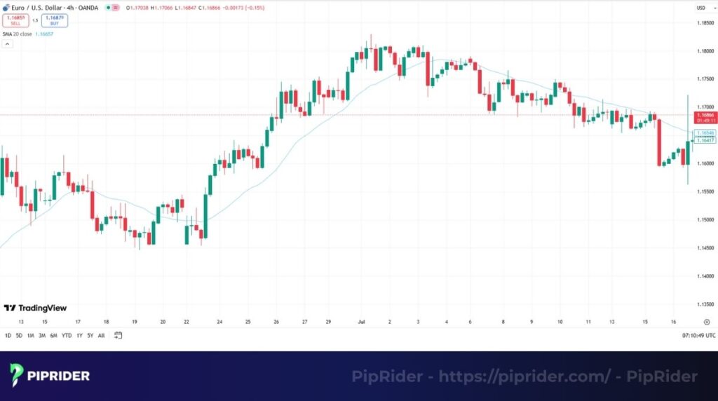
- Best Use Case: Use the 200-day SMA as a “bull/bear line” for long-term trend identification. If the price is above, look for buys; if below, look for sells.
- Pro Tip: Don’t use the SMA in a choppy, sideways market. It lags significantly and will generate false signals.
Quick Specs:
- Best timeframes: H4, Daily, Weekly.
- Complexity: Beginner.
2.2. Exponential Moving Average (EMA)
The Exponential Moving Average (EMA) is similar to the SMA but gives more weight to recent price data. This makes it react much faster to market changes, reducing the lag found in standard moving averages.

- Best Use Case: It acts as dynamic support/resistance. In a strong trend, price often pulls back to the 21-period EMA before continuing the move.
- Pro Tip: Watch out for the “crossover” trap in ranging markets; EMAs work best when the market has clear direction.
Quick Specs:
- Best timeframes: M15, H1, H4.
- Complexity: Beginner.
2.3. Supertrend Indicator
A favorite among modern traders for its simplicity, the Supertrend Indicator plots a single line that changes color based on the trend direction (Green for Uptrend, Red for Downtrend) using ATR to adjust for volatility.
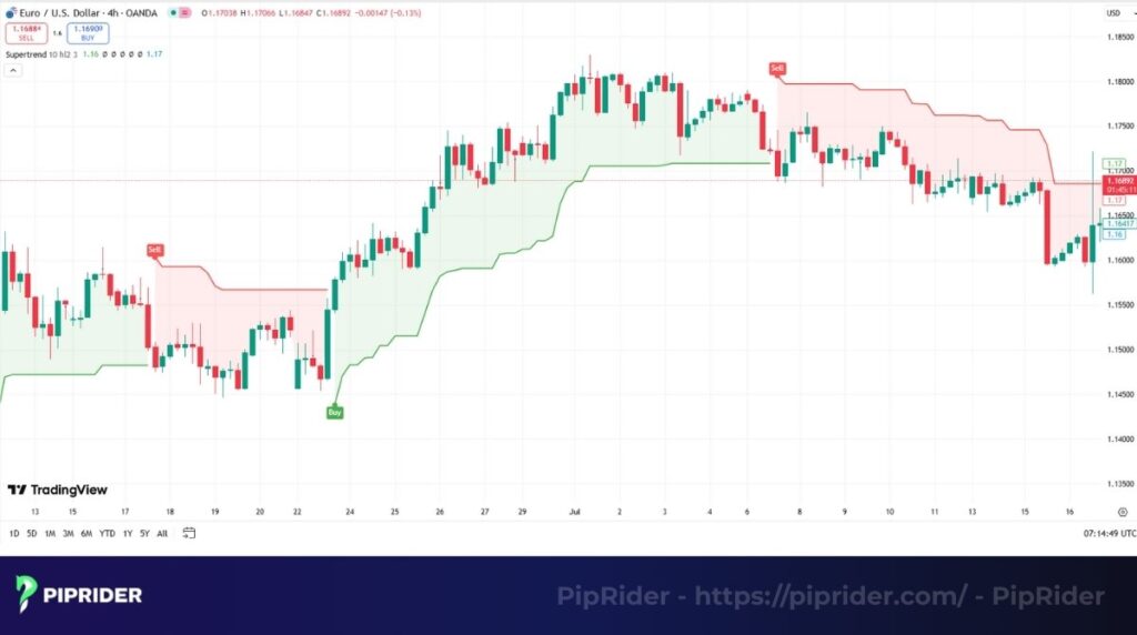
- Best Use Case: It is the ultimate trailing stop-loss tool. As long as the line is green, you hold your buy position. When it flips red, you exit.
- Pro Tip: Do not use this as a standalone entry signal; combine it with Price Action to avoid buying at the top.
Quick Specs:
- Best timeframes: All timeframes.
- Complexity: Beginner.
2.4. Ichimoku Cloud
At first glance, it looks chaotic, but the Ichimoku Cloud is a complete “all-in-one” trading system. It displays trend direction, momentum, and future support/resistance zones in a single glance.
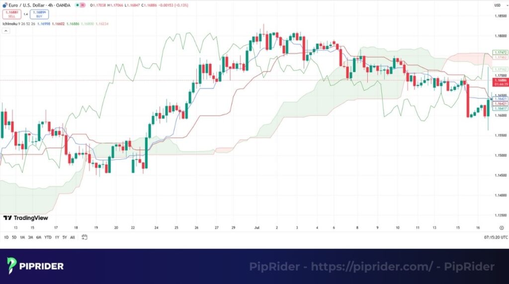
- Best Use Case: The “Kumo Cloud” is the key. If the price is above the Cloud, the trend is bullish. The thickness of the Cloud indicates the strength of the support/resistance.
- Pro Tip: Ignore the lines if the price is trading inside the Cloud—this indicates a trendless, noisy market.
Quick Specs:
- Best timeframes: H4, Daily.
- Complexity: Advanced.
2.5. Aroon Indicator
While moving averages lag, the Aroon Indicator attempts to spot the start of a new trend. It measures how long it has been since the last high or low occurred.
- Best Use Case: Identify trend changes early. When “Aroon Up” crosses above “Aroon Down,” it signals that a new uptrend may be emerging.
- Pro Tip: Watch for the lines hitting 100. If Aroon Up stays at 100, it confirms a very strong, persistent trend.
Quick Specs:
- Best timeframes: H4, Daily, Weekly.
- Complexity: Intermediate.
2.6. Parabolic SAR
“SAR” stands for Stop and Reverse. The Parabolic SAR places dots above or below price candles to signal current momentum direction and potential reversal points.

- Best Use Case: It excels as an aggressive exit tool. In a fast-moving trend, move your stop loss to the level of the most recent Parabolic SAR dot to lock in profits.
- Pro Tip: This indicator is notorious for getting “chopped up” in sideways markets. Only turn it on when you see a clear breakout.
Quick Specs:
- Best timeframes: H1, H4, Daily.
- Complexity: Intermediate.
3. Top momentum indicators every trader must know
While trend indicators identify the direction, Momentum Indicators quantify the rate of change and strength behind price movements. These oscillators are essential for identifying overbought and oversold conditions, helping traders spot potential trend reversals or divergences before they become visible on the price chart.
3.1. Relative Strength Index (RSI)
The Relative Strength Index (RSI) is the world’s most popular oscillator. It measures the speed of price changes on a scale of 0 to 100 to identify overbought (>70) and oversold (<30) conditions.
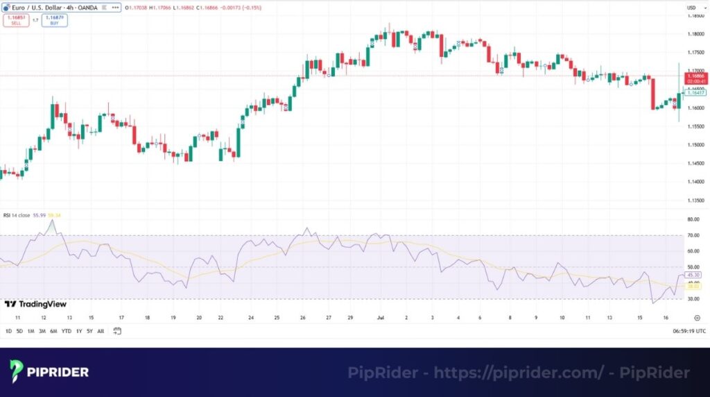
- Best Use Case: Spotting Divergence. If the price makes a higher high, but the RSI makes a lower high, it is a powerful warning that the trend is exhausted.
- Pro Tip: In a strong trend, RSI can stay “overbought” for a long time. Don’t sell just because it hits 70!
Quick Specs:
- Best timeframes: H1, H4, Daily.
- Complexity: Beginner.
3.2. Moving Average Convergence Divergence (MACD)
The MACD is a hybrid tool that acts as both a trend follower and a momentum oscillator. It tracks the relationship between two moving averages of a price.
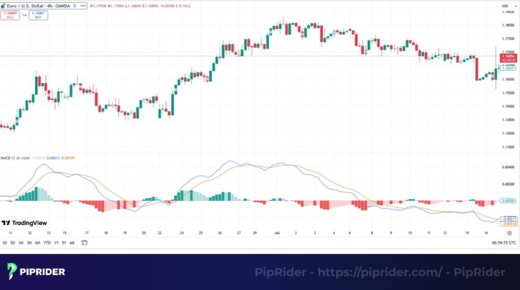
- Best Use Case: The “Zero Line Cross” determines the dominant trend, while the Histogram visualizes the strength. A rising histogram confirms the bulls are in control.
- Pro Tip: Watch the gap between the MACD line and the Signal line. If the gap widens, momentum is increasing; if it narrows, a reversal is near.
Quick Specs:
- Best timeframes: H4, Daily, Weekly.
- Complexity: Beginner to Intermediate.
3.3. Stochastic Oscillator
The Stochastic Oscillator is a sensitive tool that compares a specific closing price of a security to a range of its prices over a certain period of time. It moves faster than the RSI.
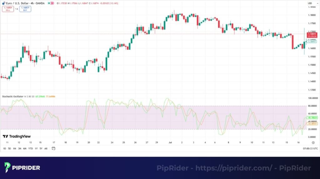
- Best Use Case: Precision timing in ranging markets. When the price hits resistance and the Stochastic crosses down from above 80, it’s a classic sell signal.
- Pro Tip: Avoid using Stochastic signals against a strong trend. It works best in sideways or “corrective” market phases.
Quick Specs:
- Best timeframes: M15, H1, H4.
- Complexity: Intermediate.
3.4. Rate of Change (ROC)
The Rate of Change (ROC) is a pure momentum oscillator that measures the percentage change in price between the current period and a specific number of periods ago.
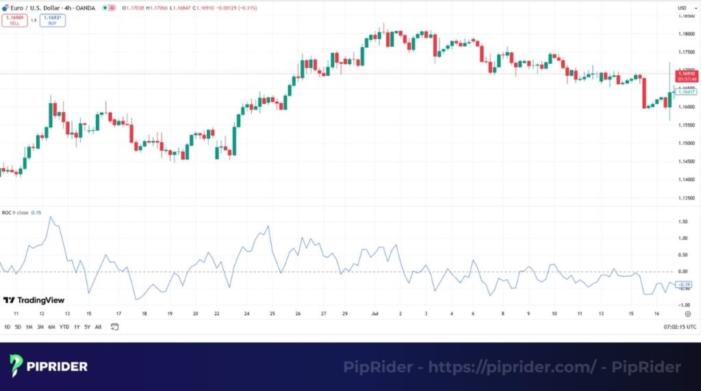
- Best Use Case: Confirming breakout strength. If price breaks a key resistance level and ROC surges to a new high, it confirms the breakout has genuine velocity.
- Pro Tip: ROC is very sensitive. It is often used to spot “divergence” where price rises but velocity slows down.
Quick Specs:
- Best timeframes: All timeframes.
- Complexity: Beginner to Intermediate.
3.5. Average Directional Index (ADX)
Unlike other oscillators, the Average Directional Index (ADX) does not tell you if the price is going up or down. It only tells you how strong the trend is.
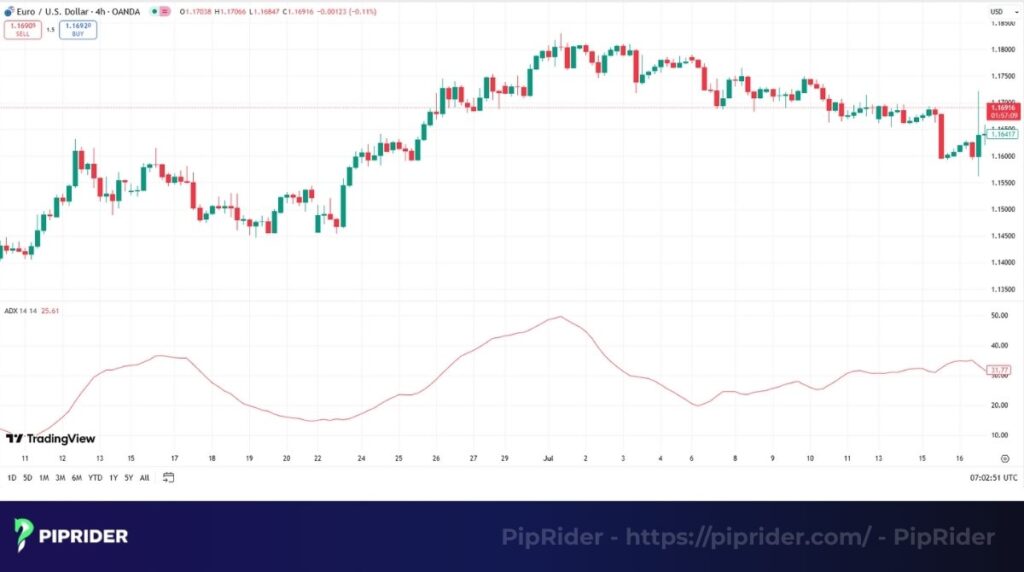
- Best Use Case: Acting as a filter. If ADX is below 25, the market is range-bound (stay out or use Stochastics). If ADX is above 25, the market is trending (use Moving Averages).
- Pro Tip: A falling ADX line doesn’t mean the trend is reversing; it just means the trend is losing strength.
Quick Specs:
- Best timeframes: H4, Daily.
- Complexity: Intermediate.
4. Volume-based technical indicators list
Volume indicators analyze the total trading activity within a specific timeframe to measure market participation and liquidity. By quantifying buying and selling pressure, these tools are essential for confirming trends and validating breakouts. For a deeper dive into this specific category, explore our dedicated ranking of the best Forex Volume Indicators.
4.1. On-Balance Volume (OBV)
Developed by Joe Granville, On-Balance Volume (OBV) is a cumulative indicator that adds volume on up-days and subtracts volume on down-days. It essentially measures buy pressure vs. sell pressure.
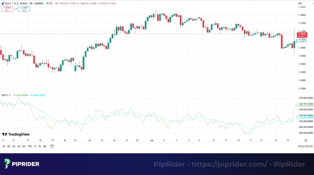
- Best Use Case: Spotting accumulation. If price is flat (moving sideways) but OBV is rising, it signals that big players are quietly buying before a breakout.
- Pro Tip: Focus on the trend of the OBV line, not the specific number value.
Quick Specs:
- Best timeframes: H4, Daily.
- Complexity: Beginner.
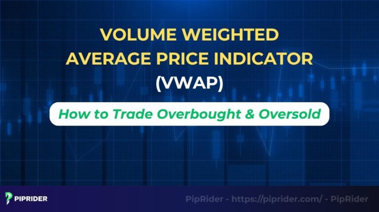
4.2. Volume Weighted Average Price (VWAP)
The VWAP (Volume Weighted Average Price) calculates the average price a security has traded at throughout the day, based on both volume and price. It is the benchmark for institutional traders.

- Best Use Case: Intraday trend filter. If price is above VWAP, buyers are in control (look for longs). If below, sellers are in control.
- Pro Tip: VWAP resets every day. It is strictly for intraday trading (M1 to H1 charts).
Quick Specs:
- Best timeframes: M1, M5, M15.
- Complexity: Intermediate.
4.3. Money Flow Index (MFI)
Think of the Money Flow Index (MFI) as the “Volume-weighted RSI.” It identifies overbought/oversold conditions but factors in trading volume, making it more robust than standard RSI.
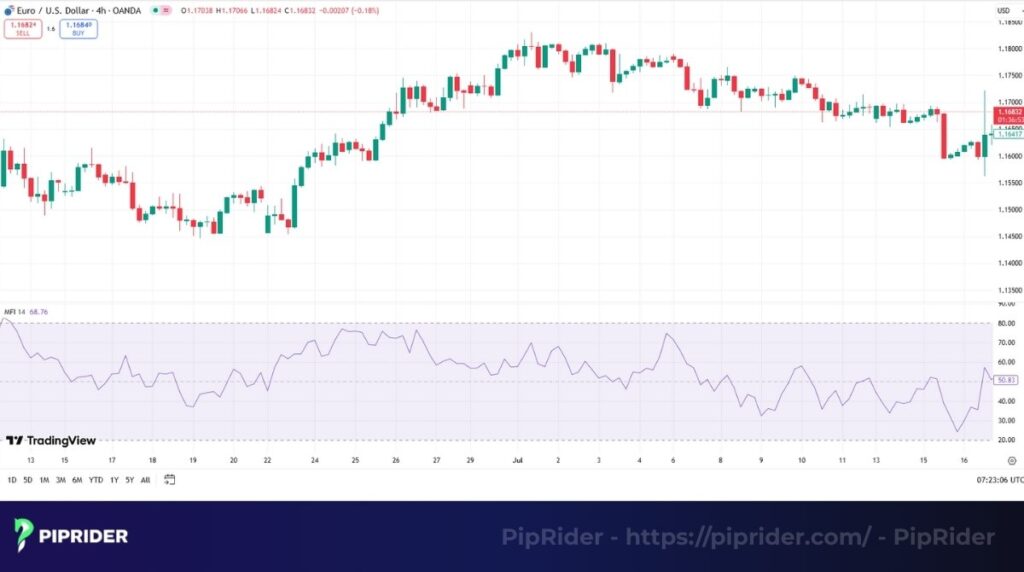
- Best Use Case: Divergence trading. A divergence on the MFI is often more reliable than RSI because it confirms that volume support is drying up.
- Pro Tip: Watch for MFI crossing above 20 (Buy) or below 80 (Sell) as a confirmation signal.
Quick Specs:
- Best timeframes: H1, H4, Daily.
- Complexity: Intermediate.
4.4. Chaikin Money Flow (CMF)
Developed by Marc Chaikin, the Chaikin Money Flow (CMF) measures the flow of money into or out of an asset over a specific period (usually 20 or 21 days).
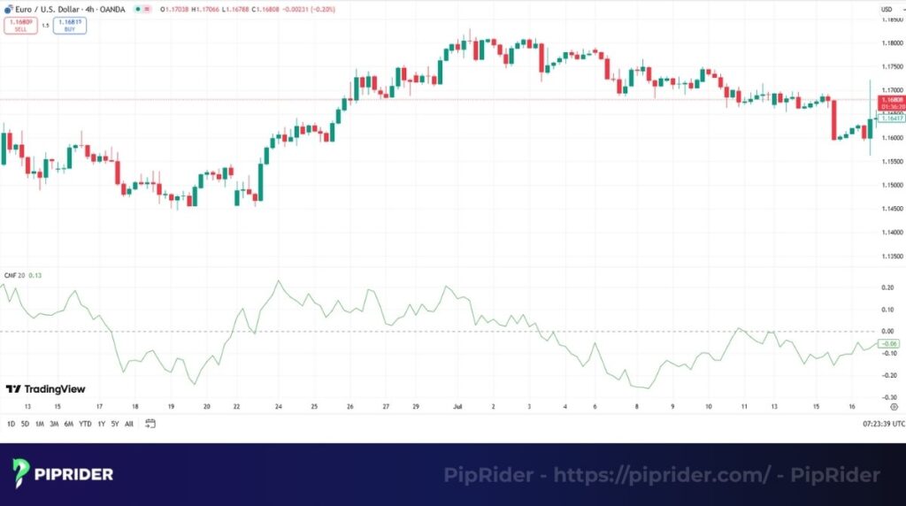
- Best Use Case: Confirming breakouts. If price breaks resistance and CMF is firmly above the Zero Line, the breakout is valid.
- Pro Tip: A CMF value above +0.25 indicates strong buying pressure; below -0.25 indicates strong selling pressure.
Quick Specs:
- Best timeframes: H4, Daily.
- Complexity: Intermediate.
4.5. Accumulation/Distribution Line (ADL)
The Accumulation/Distribution Line (ADL) tracks the relationship between closing price and the trading range, multiplied by volume. It answers: “Did buyers control the close?”
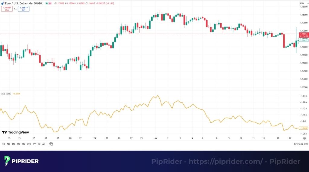
- Best Use Case: Detecting underlying supply/demand. A rising ADL during a downtrend suggests accumulation (smart money buying the dip), hinting at a reversal.
- Pro Tip: Divergence between price and ADL is the most powerful signal this tool offers.
Quick Specs:
- Best timeframes: Daily, Weekly.
- Complexity: Advanced.
5. Top volatility indicators to measure market fluctuations
Volatility indicators measure the speed and magnitude of price movements, independent of market direction. These tools are critical for risk management, helping traders adjust stop-loss levels dynamically and identify high-probability breakouts from low-volatility ranges.
5.1. Bollinger Bands
Created by John Bollinger, Bollinger Bands consist of lines plotted two standard deviations away from a simple moving average. They expand when volatility is high and contract when it is low.

- Best Use Case: The “Bollinger Squeeze.” When the bands tighten significantly, it signals a period of low volatility that is almost always followed by an explosive breakout.
- Pro Tip: Price touching the outer band is not a signal to reverse; in a strong trend, price can “ride the bands” for a long time.
Quick Specs:
- Best timeframes: All timeframes.
- Complexity: Beginner to Intermediate.
5.2. Average True Range (ATR)
The ultimate risk management tool, the Average True Range (ATR) measures the average range (High minus Low) of price movement over a set period. It doesn’t tell you direction, only volatility.
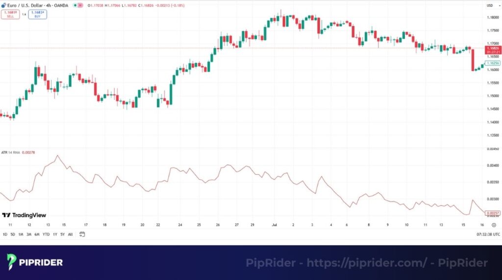
- Best Use Case: Setting Stop Losses. Instead of a fixed number of pips, set your stop at “2x ATR.” This adjusts your risk dynamically to the current market mood.
- Pro Tip: If ATR is spiking, the market is volatile—reduce your position size to stay safe.
Quick Specs:
- Best timeframes: All timeframes.
- Complexity: Beginner.
5.3. Donchian Channel
The Donchian Channel is a simple channel formed by plotting the highest high and lowest low over a set period (e.g., 20 days).
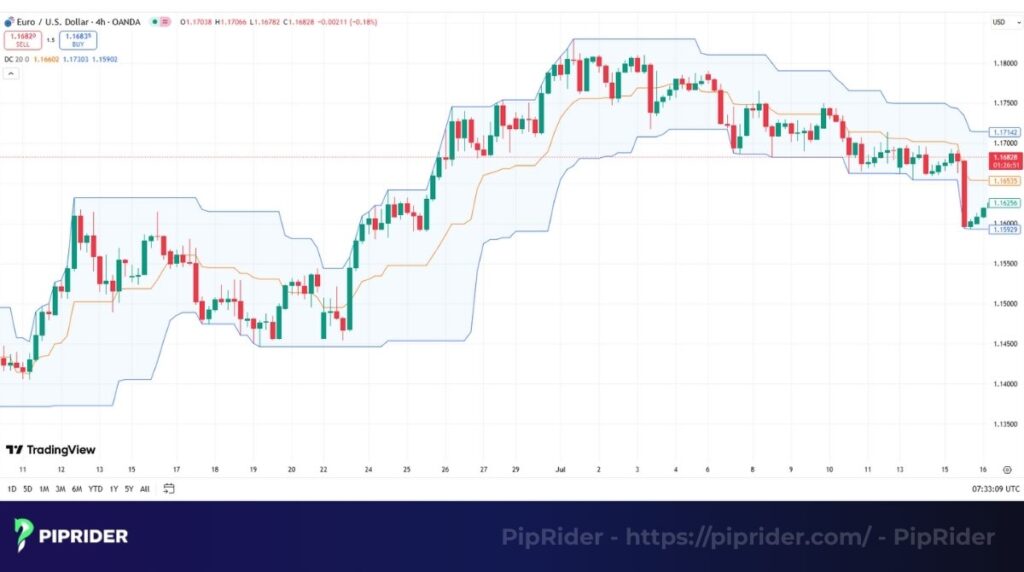
- Best Use Case: Breakout trading. The famous “Turtle Trading” strategy simply bought when price broke the Upper Donchian band and sold when it broke the Lower band.
- Pro Tip: It is visually excellent for identifying support and resistance levels without drawing manual lines.
Quick Specs:
- Best timeframes: H4, Daily, Weekly.
- Complexity: Beginner.
5.4. Keltner Channel
The Keltner Channel is similar to Bollinger Bands but uses ATR for channel width instead of standard deviation. This makes it smoother and less prone to fake-outs.
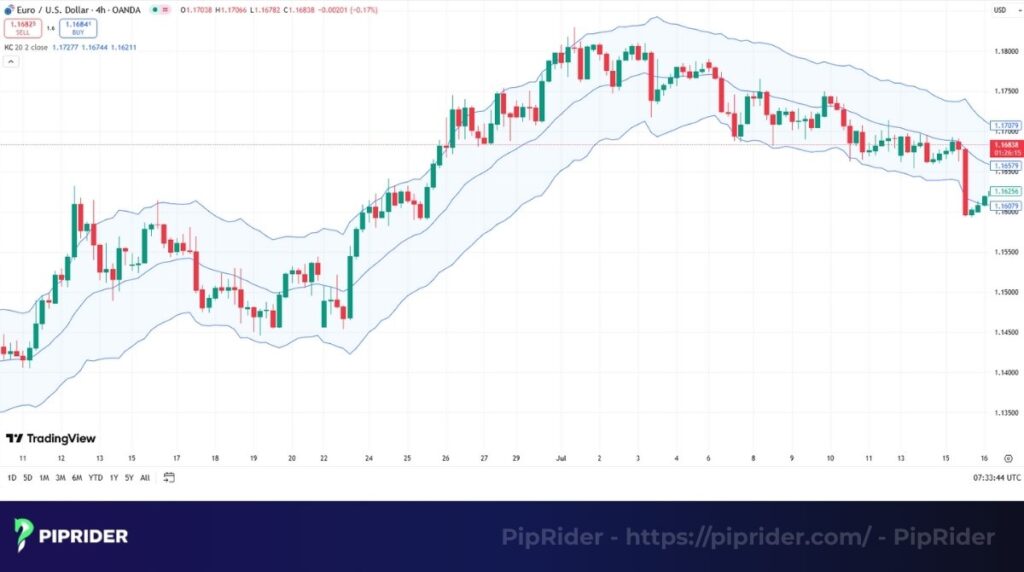
- Best Use Case: Trend Pullbacks. In an uptrend, buy when price dips to the middle line or the lower channel band.
- Pro Tip: Compare Keltner Channels with Bollinger Bands. If Bollinger Bands squeeze inside the Keltner Channels, a massive move is coming.
Quick Specs:
- Best timeframes: All timeframes.
- Complexity: Intermediate.
5.5. Standard Deviation Indicator
The Standard Deviation Indicator is the purest statistical measure of volatility. It shows how widely prices are dispersed from the average price.
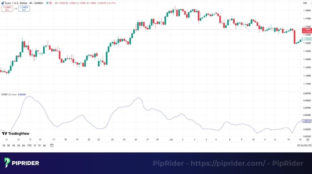
- Best Use Case: Predicting big moves. When Standard Deviation hits a historical low, the market is “coiled” and ready to explode (though it doesn’t predict direction).
- Pro Tip: Use it as a filter. Don’t enter breakout trades if Standard Deviation is already at extreme highs—the move might be over.
Quick Specs:
- Best timeframes: All timeframes.
- Complexity: Intermediate.
6. Top market breadth indicators (For Stock Indices & Risk Sentiment)
⚠️ Important Note: These indicators are designed for the stock market (like S&P 500, NASDAQ). However, Forex traders must understand them because stock market health dictates global Risk Sentiment (Risk-On vs. Risk-Off), which directly drives currency flows (e.g., AUD vs. JPY).
6.1. Advance-Decline Line (AD Line)
The Advance-Decline Line (AD Line) is a cumulative running total of advancing stocks minus declining stocks. It measures the breadth of market participation.
- Best Use Case: Risk Sentiment Filter. If the S&P 500 rises but the AD Line falls, the rally is weak. This often signals a pending “Risk-Off” move, suggesting traders should look to buy Safe Haven currencies (USD, JPY, CHF).
- Pro Tip: Do not apply this to individual forex pairs. Use it on the US500 index to gauge the global macro environment.
Quick Specs:
- Scope: Stock Indices (S&P 500, NYSE).
- Complexity: Beginner.
6.2. Percentage of Stocks above a Moving Average
The Percentage of Stocks above a Moving Average shows what percentage of stocks in an index are trading above their 50-day or 200-day MA.
- Best Use Case: Spotting capitulation bottoms. When only 5-10% of stocks are above their 200-day MA, the market is oversold. A reversal here often triggers a “Risk-On” rally, boosting currencies like AUD, NZD, and GBP.
- Pro Tip: Readings above 80% suggest the market is frothy and a correction (Risk-Off) may be imminent.
Quick Specs:
- Scope: Stock Indices.
- Complexity: Intermediate.
6.3. New Highs-New Lows Indicator
The New Highs-New Lows Indicator measures the number of stocks making new 52-week highs vs. new 52-week lows.
- Best Use Case: Bull market confirmation. A healthy bull market must have more new highs than new lows. If the market rises but new highs decrease, risk appetite is fading.
- Pro Tip: A spike in New Lows is a strong signal of a bear market beginning, often leading to a stronger US Dollar.
Quick Specs:
- Scope: Stock Indices.
- Complexity: Beginner.
6.4. McClellan Oscillator
The McClellan Oscillator is a more sensitive breadth indicator derived from the AD Line. It moves above and below zero to show short-term shifts in money flow.
- Best Use Case: Short-term turning points for Index CFDs (US30, NAS100). When the oscillator drops deeply negative (oversold) and turns up, it’s a strong buy signal for the broad market.
- Pro Tip: Useful for swing traders trading indices alongside major forex pairs.
Quick Specs:
- Scope: Stock Indices.
- Complexity: Advanced.
6.5. Arms Index (TRIN)
Often called TRIN, the Arms Index is a contrarian sentiment indicator that compares advancing/declining stocks to advancing/declining volume. It measures market “panic.”
- Best Use Case: Spotting panic bottoms. A TRIN reading above 2.0 or 3.0 indicates extreme panic dumping. This creates a high-probability reversal point for both Indices and correlated “Risk” currencies.
- Pro Tip: Remember, for TRIN, “Low is Good” (Bullish), and “High is Bad” (Bearish/Panic).
Quick Specs:
- Scope: Stock Indices.
- Complexity: Advanced.
7. How to use technical indicators in trading?
Learning about individual indicators is the first step. The real skill of a trader is learning how to combine the tools from the above list into a coherent system. A successful trading strategy is like a team of experts, each with a specific job.
A coach wouldn’t ask their star striker to play in goal. In the same way, a trader shouldn’t expect a trend indicator to do an indicator’s job. Each tool has a specialized purpose, using it effectively can help in reading the overall market accurately.
7.1. When to use momentum vs. trend indicators?
Making this distinction is the most fundamental part of technical analysis. Before a trader even looks at an indicator, their first job is to diagnose the market’s current personality. The effectiveness of any tool depends on your trading style.
- If the market is in a clear, strong trend: Ideal to use trend indicators like Moving Averages and the Supertrend. Their job is to keep you on the right side of the market. Avoid using sensitive oscillators like Stochastic and RSI , as they may generate many false trend reversals signals.
- If the market is choppy and moving sideways in a range: Switching to momentum tools like the RSI would be ideal. These tools are designed to find overbought and oversold turning points. Using a trend indicator like a Moving Average here can be less effective, as the prices move back and forth across it without showing a clear trend.
7.2. Using volatility and volume indicator as filters
These two families of indicators are your “truth detectors”. They function as complementary indicators and provide the crucial context that can turn a good signal into a great one, or warn you to stay away from a bad one.
- Volatility indicators (like ATR and Standard Deviation) are your risk managers. ATR helps to determine stop loss size, ensuring risk is controlled. A low price fluctuation reading from the Standard Deviation gives you confidence to trade a potential breakout.
- Volume indicators (like OBV) are your conviction gauges. A breakout on a price chart is interesting. One that is confirmed by a new high in the OBV is a high-confidence trade. It tells you the ‘smart money’ is backing the move. Moves without volume confirmation warrant caution and are unreliable.
7.3. Strategy example: The MACD + Stochastic combo
The MACD + Stochastic combo is a well-known strategy that pairs a trend indicator with a momentum indicator for confirmation. The following are just some basic indicator examples to illustrate the concept.
The logic: We use the slower MACD to identify the primary direction and the faster oscillator to find a precise, low-risk entry point on a pullback.
The Trade rules:
- Trend: The MACD must be trading above its zero line.
- Pullback: Wait for the oscillator to drop into the oversold zone (<20).
- Entry: Enter when the Stochastic Oscillator gives a bullish crossover while still in the oversold zone.
7.4. How to set your stop loss and take profit with indicators
Indicators are fantastic for more than just entries; they provide objective levels for managing your trade, giving you clear trading signals for when to exit.
- When setting a stop loss, the ATR is your best tool. A common method is to place it at a distance of 2x its current value from your entry. Parabolic SAR and Supertrend are also great tools for a dynamic trailing stop.
- Setting a take profit: Oscillators like the RSI and Stochastic Oscillator are excellent for this. If you are in a long trade and the RSI moves into the overbought zone (>70), it’s a logical and objective signal to consider taking profit. Another method is to use the bands and take profit when the price touches the opposite outer band.
8. Frequently asked questions about Technical indicators
Here are some quick, no-nonsense answers to the most important questions that new traders have when they first dive into the world of indicators.
9. Conclusion
Navigating the financial markets requires the right tools, but having too many can be just as dangerous as having none. This list of 26 technical indicators gives you a complete arsenal, but the key to success lies in selection, not accumulation.
A robust trading strategy relies on confluence. By combining a trend indicator to identify the direction, a momentum oscillator to time your entry, and a volatility tool to manage risk, you transform raw data into high-probability trading signals. Remember, these tools are historical calculators, not crystal balls—always validate them with price action and market structure.
Ready to build your specific toolkit? If you want to narrow down this extensive list to the absolute essentials, read our curated guide on the Best Technical Indicators to start with the most effective tools for profitable trading.